
It runs in the family
Designing a university website is one thing: laying down a family of sites for a business school is a totally different ballgame.
Universities and schools in Hong Kong are particularly autonomous: even some departments within a school have full permission to roll out a brand strategy that's only loosely based on the parent university's identity.
Whether it's a blessing or a curse, depends on who's at the helm of such a brand strategy, what kind of budget they have access to and how many people are involved before a decision is ultimately made.
As a result, many departmental sites within the same university domain look completely different no matter where you look. These are Hong Kong University departments—
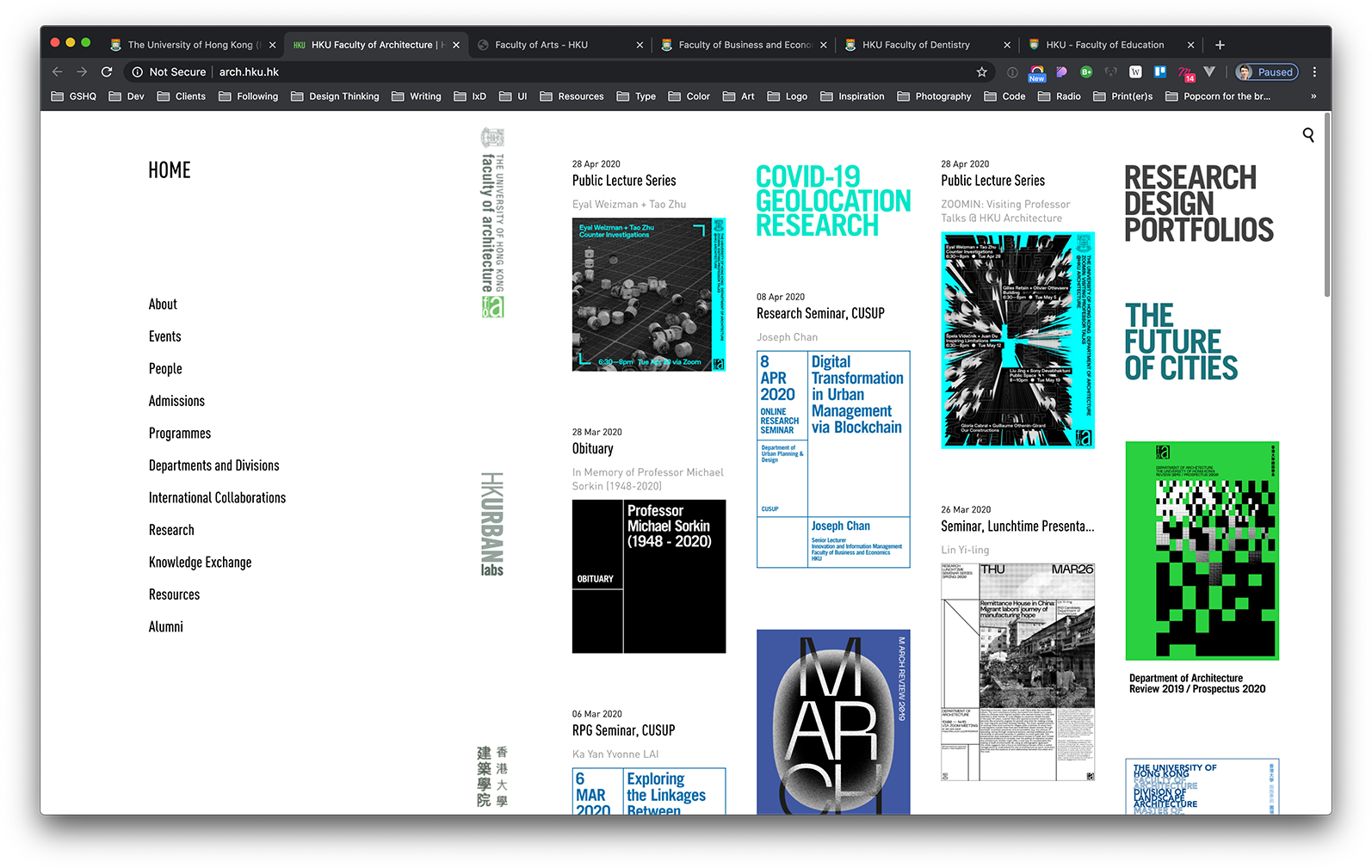
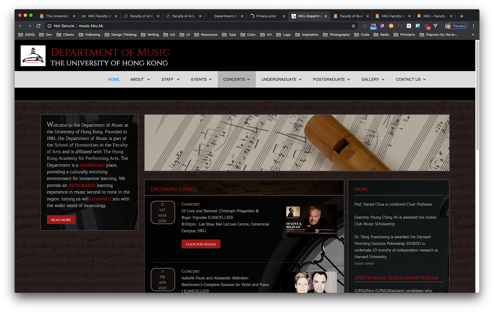
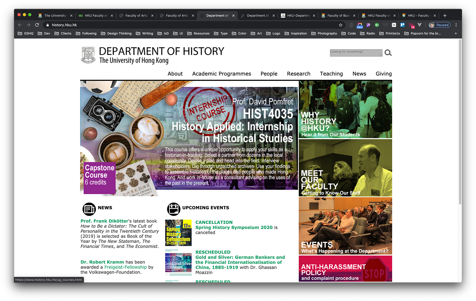
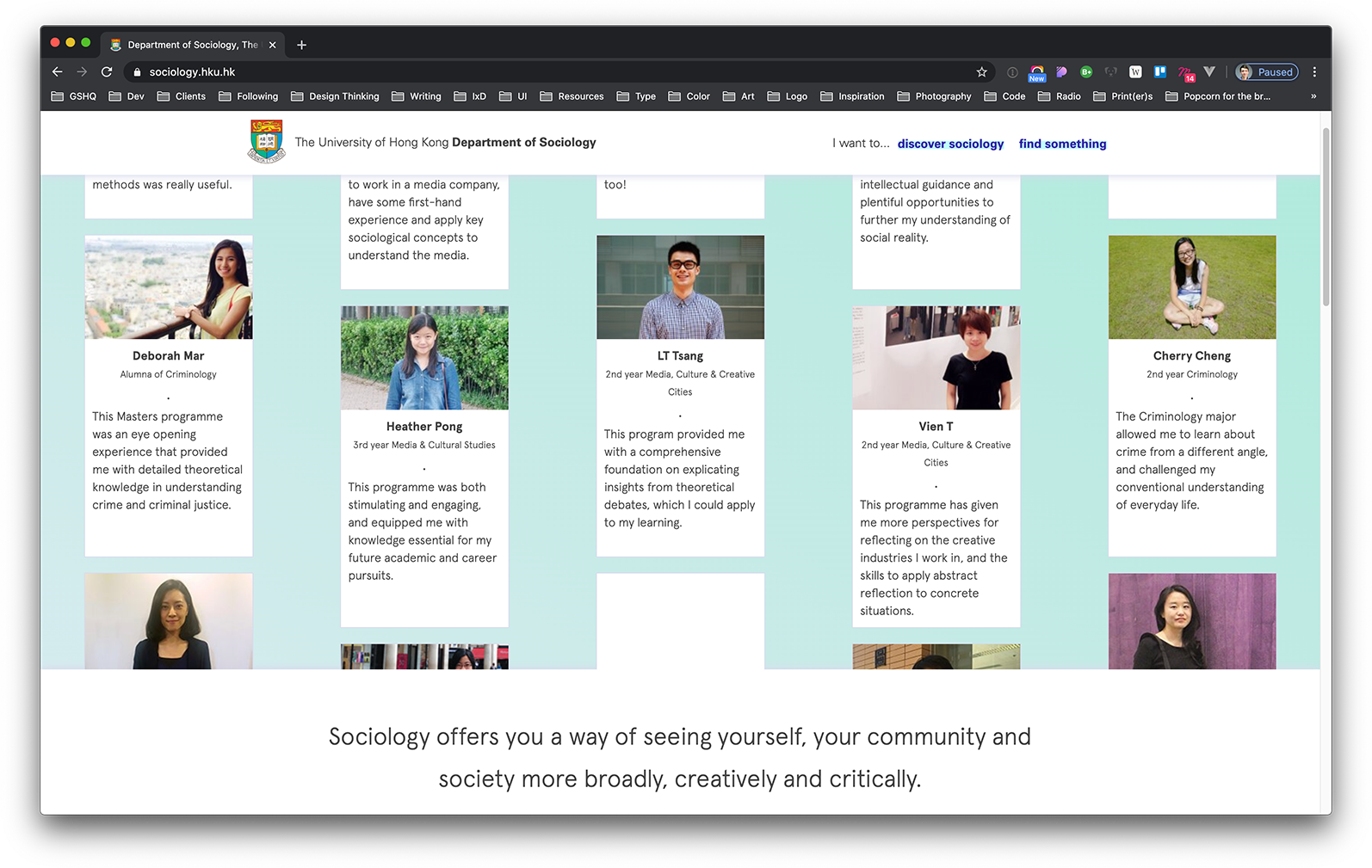
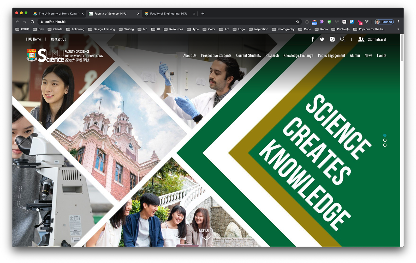
As you can see (at this scale) there's hardly a common denominator among any of these sites. When we worked on the sociology department site (second from the left, bottom row), it was almost daunting in how few constraints there were: the sky was literally the limit.
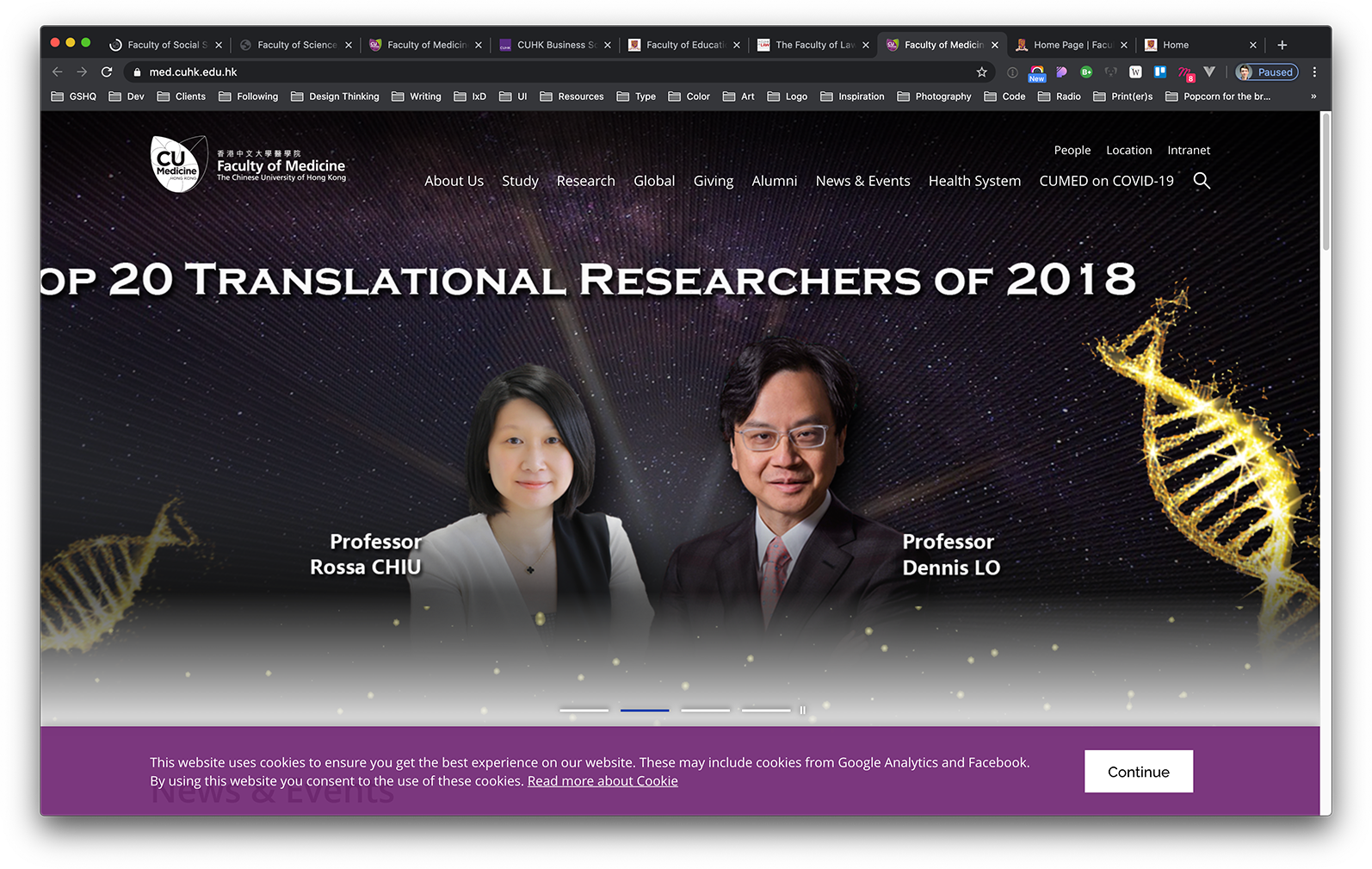
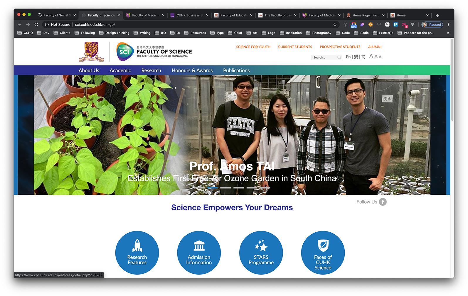
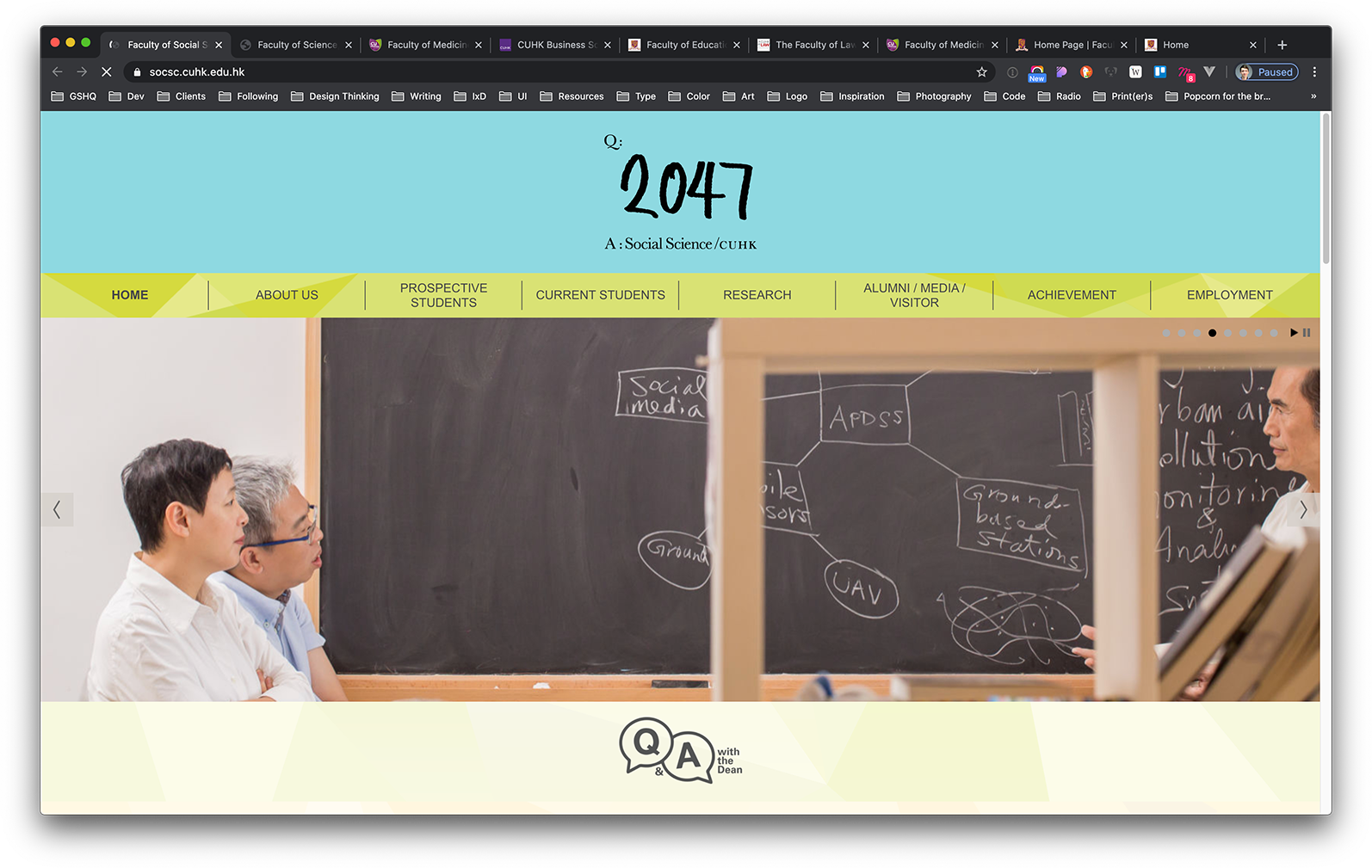
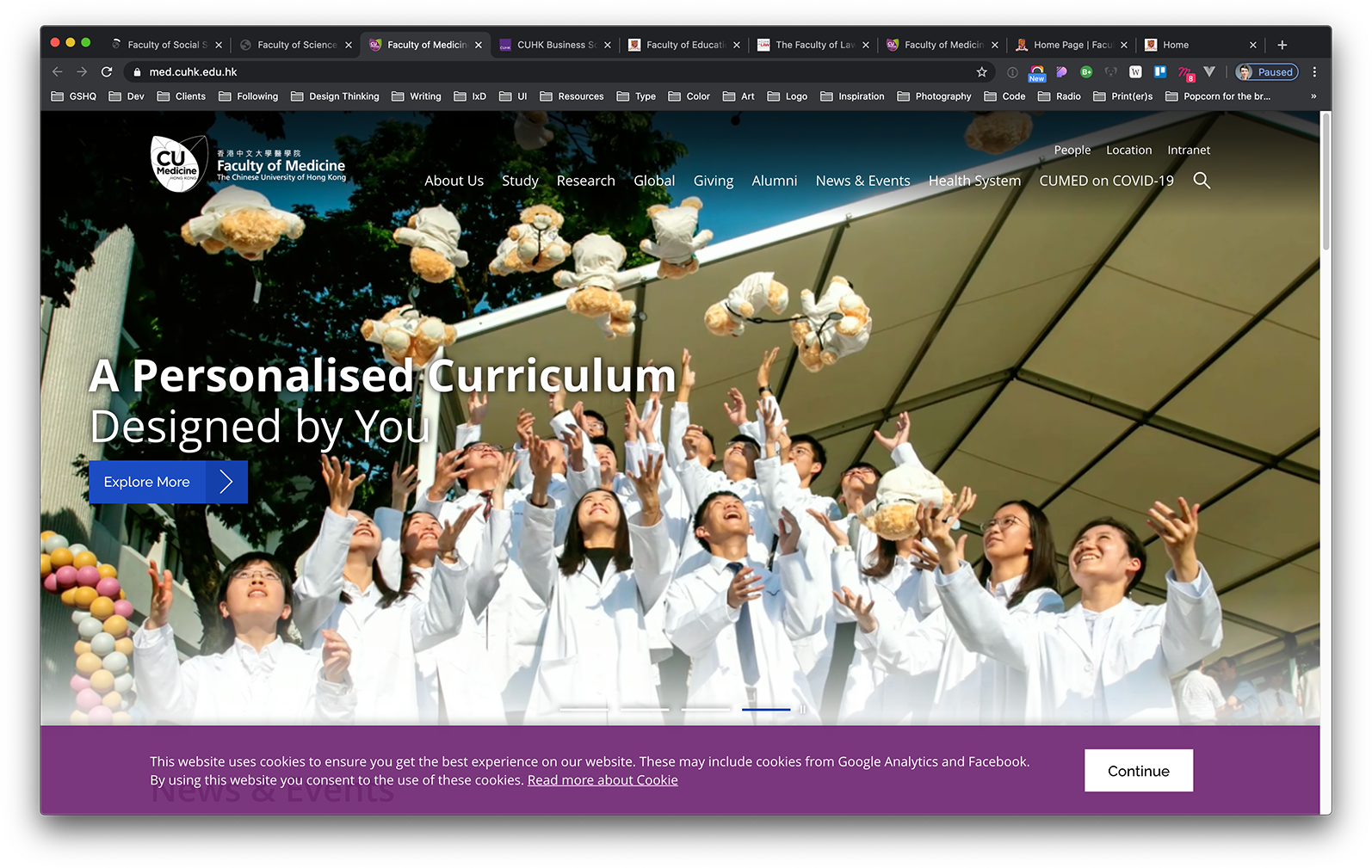
The disparity takes unprecedented levels at the Chinese University of Hong Kong. At this renowned university, there are eight faculties, each with their own website—
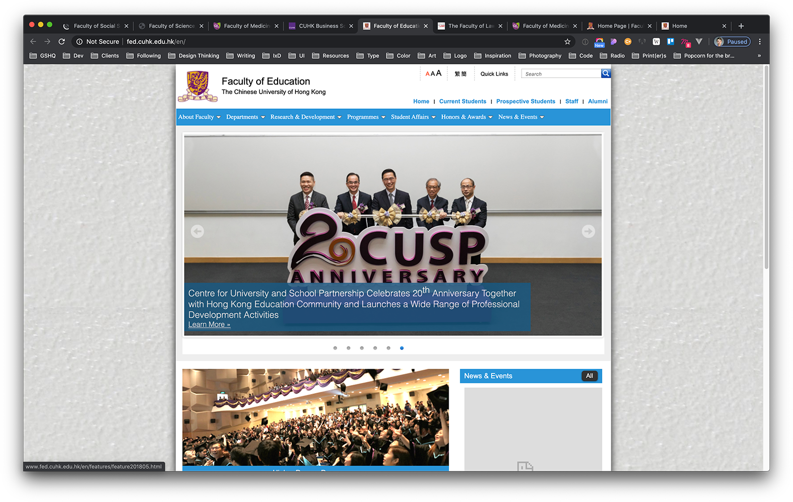
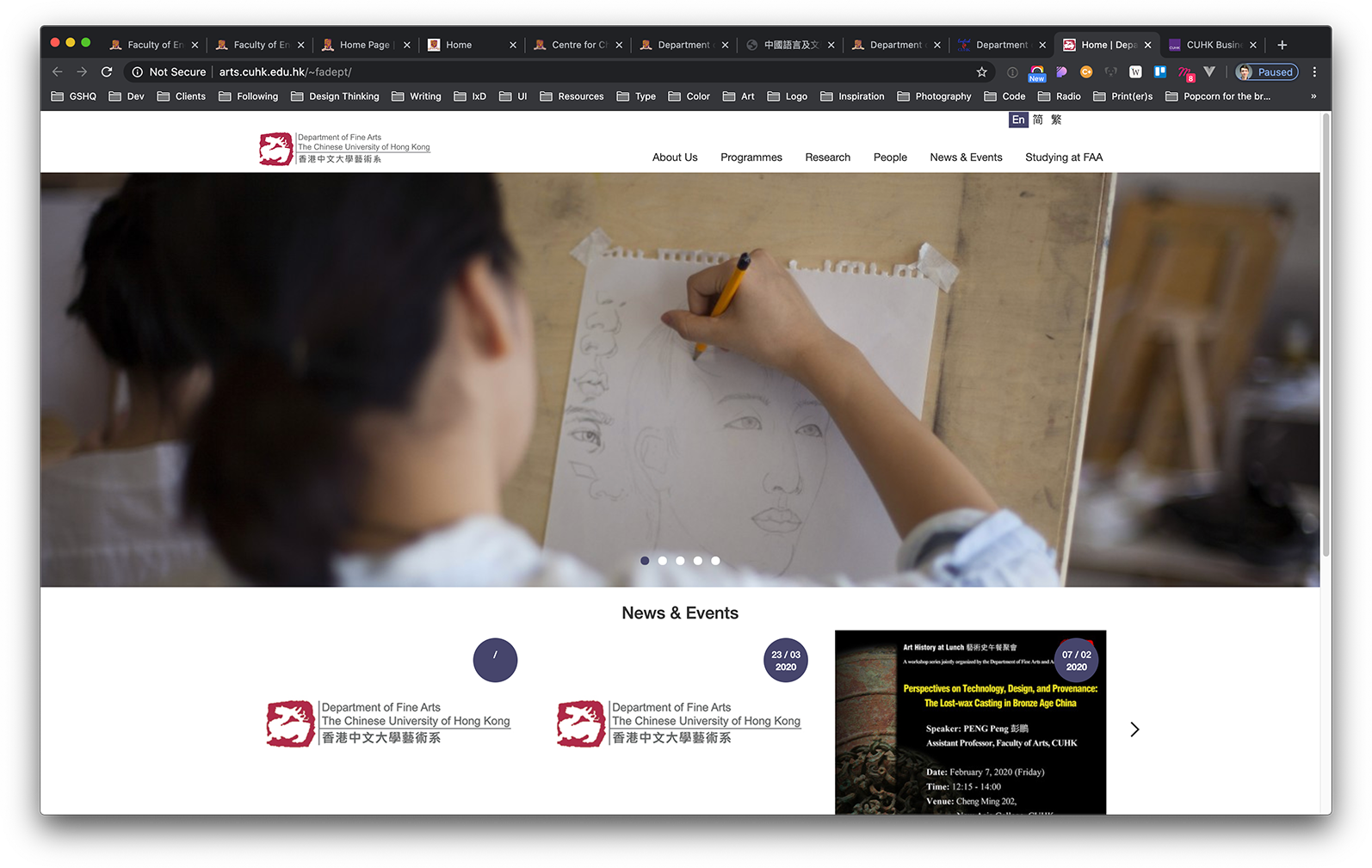
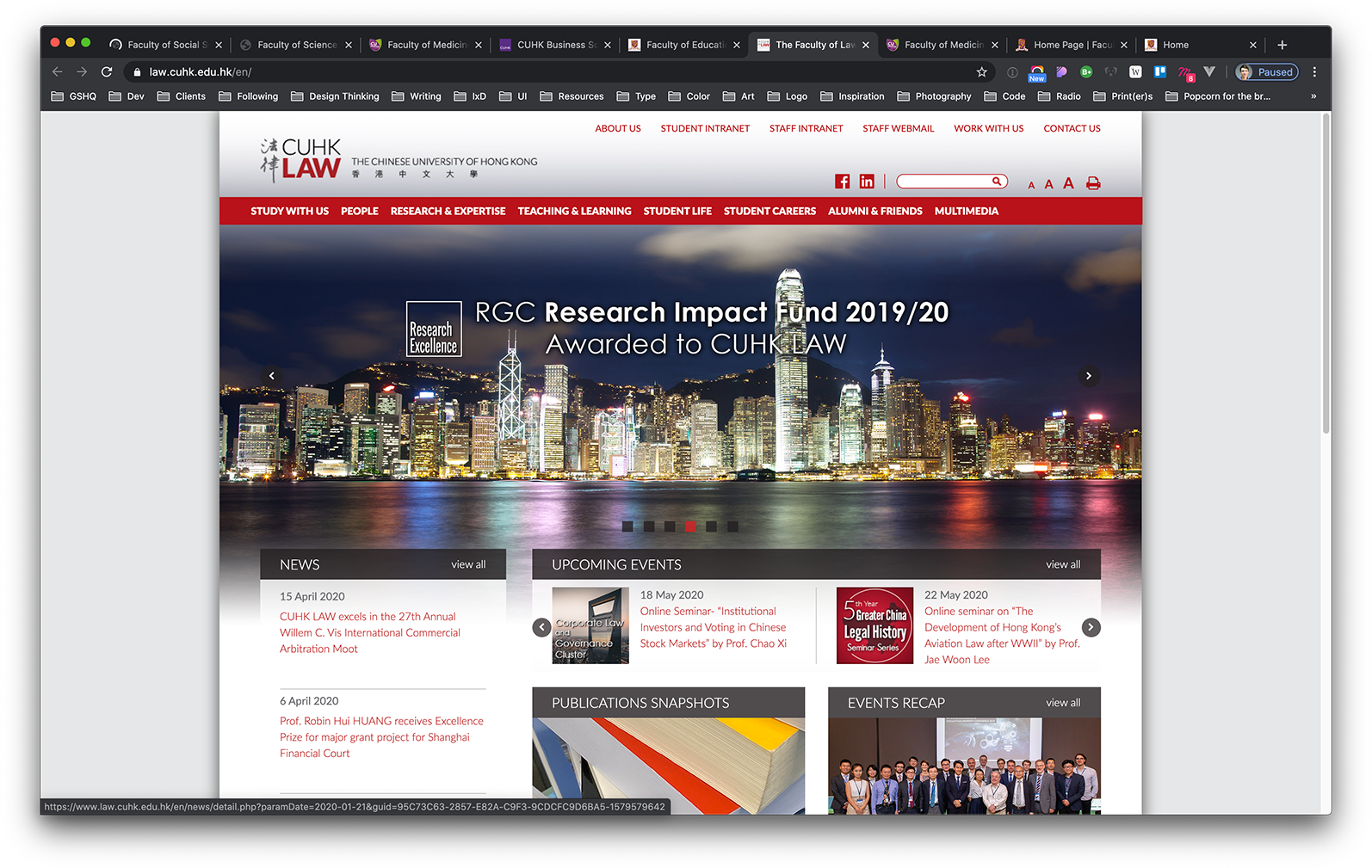
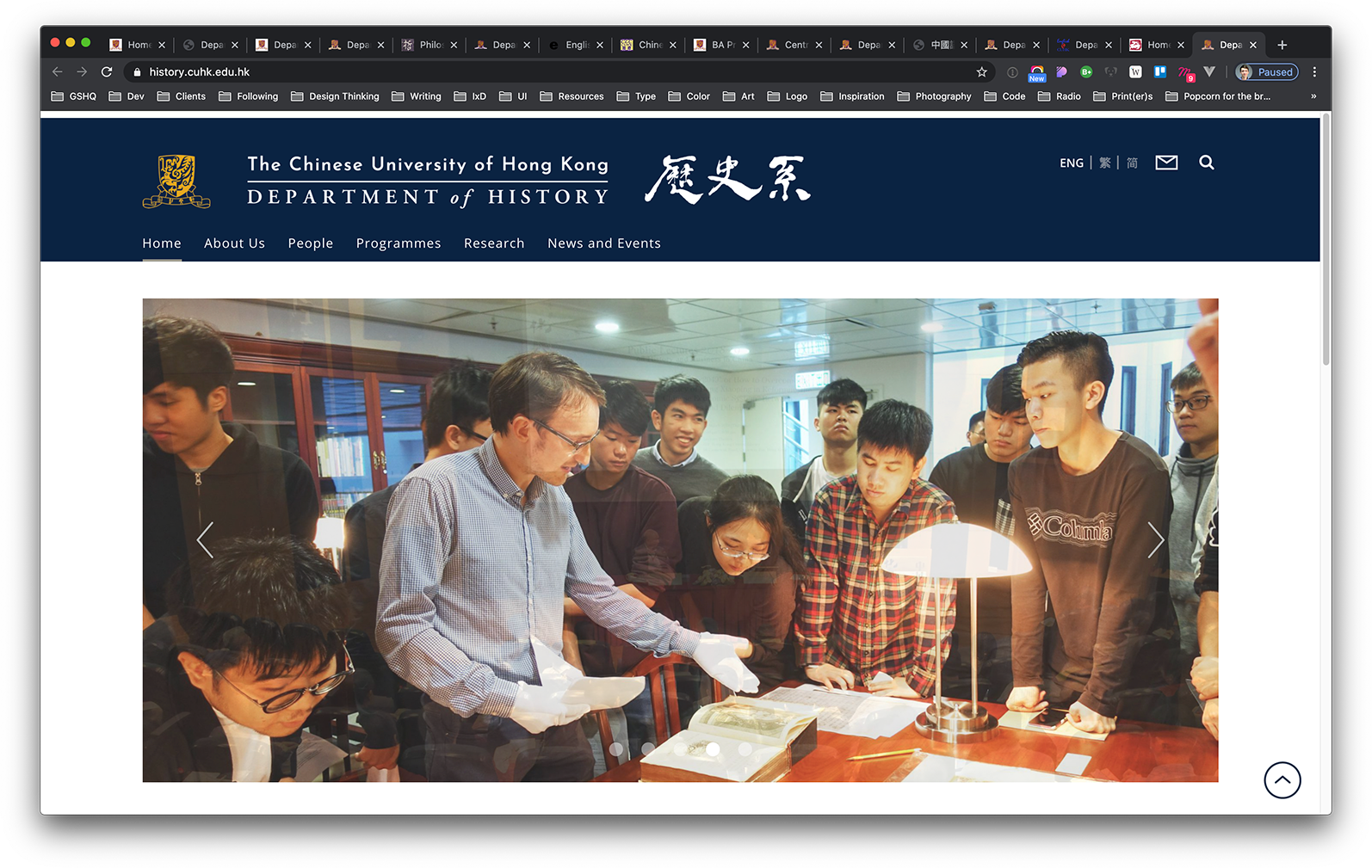
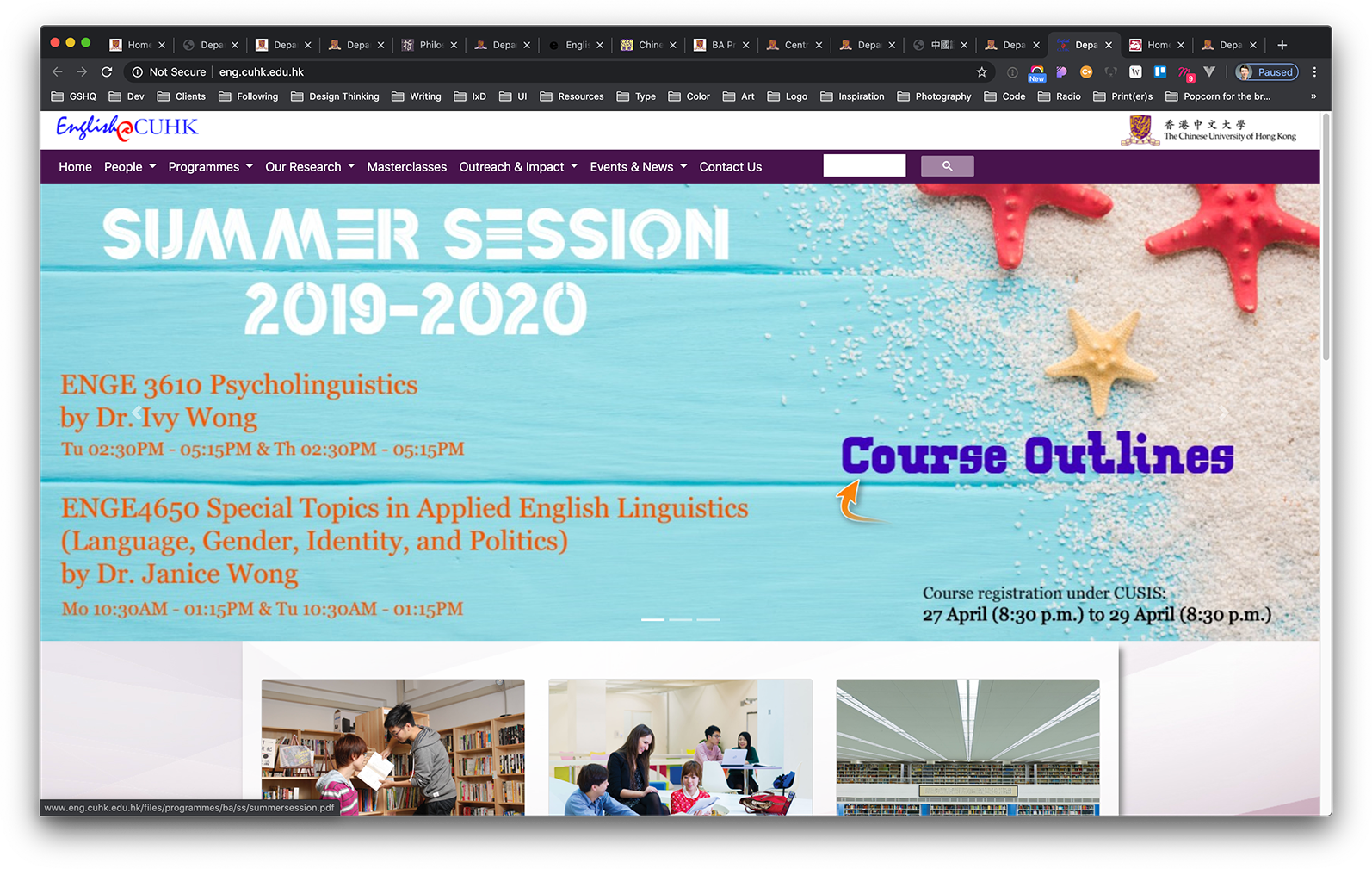
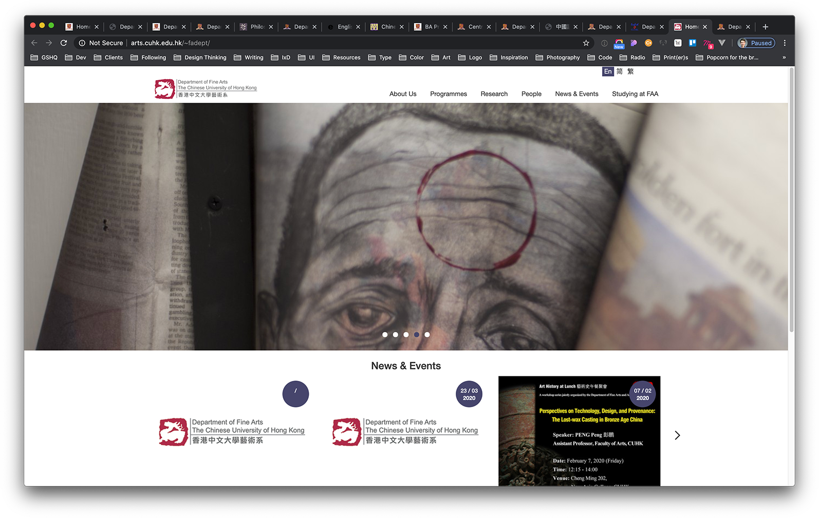
Each of these faculties have a varying number of departments, often with websites of their own. The CUHK Faculty of Arts (second from left, top row) has fifteen departments, each with their own website—
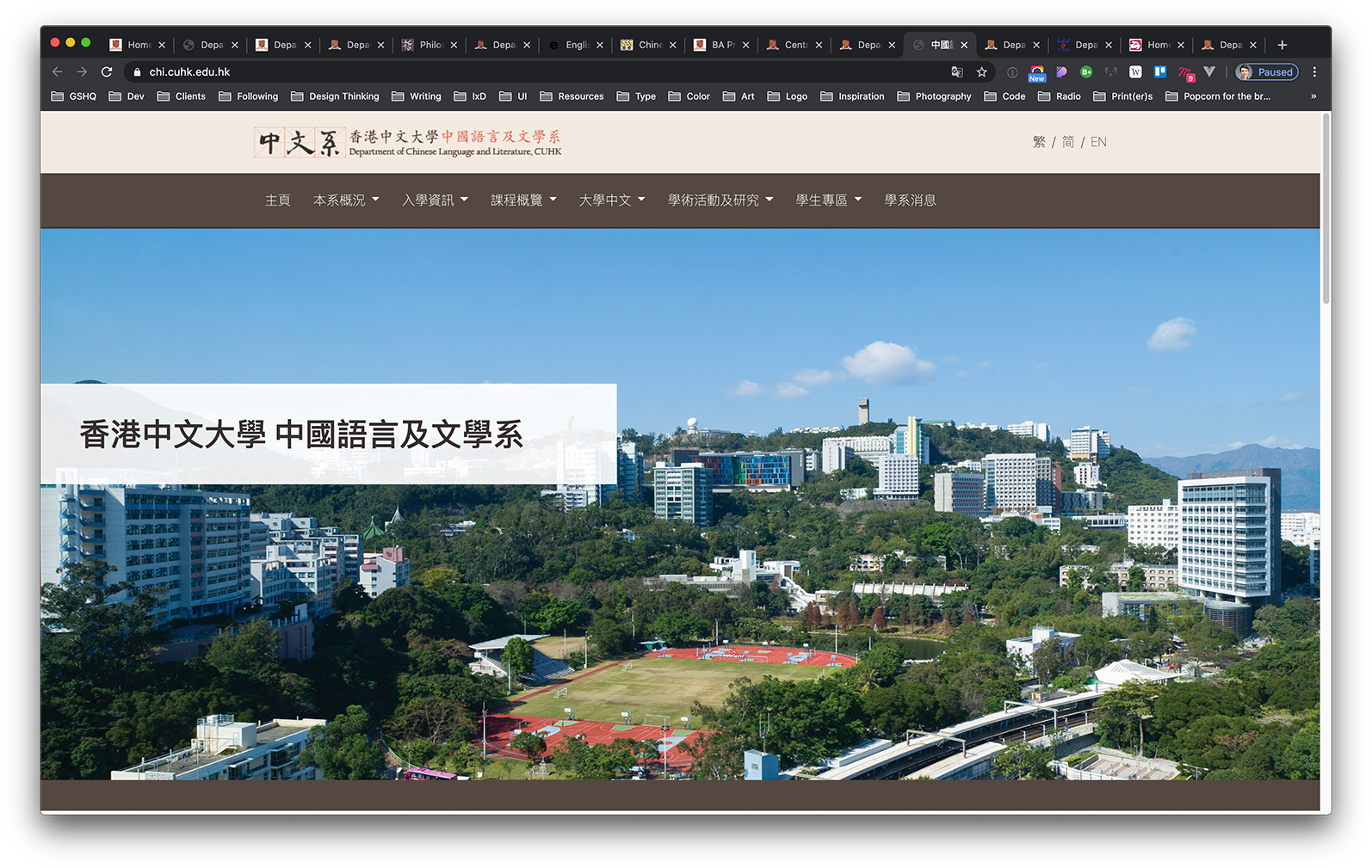
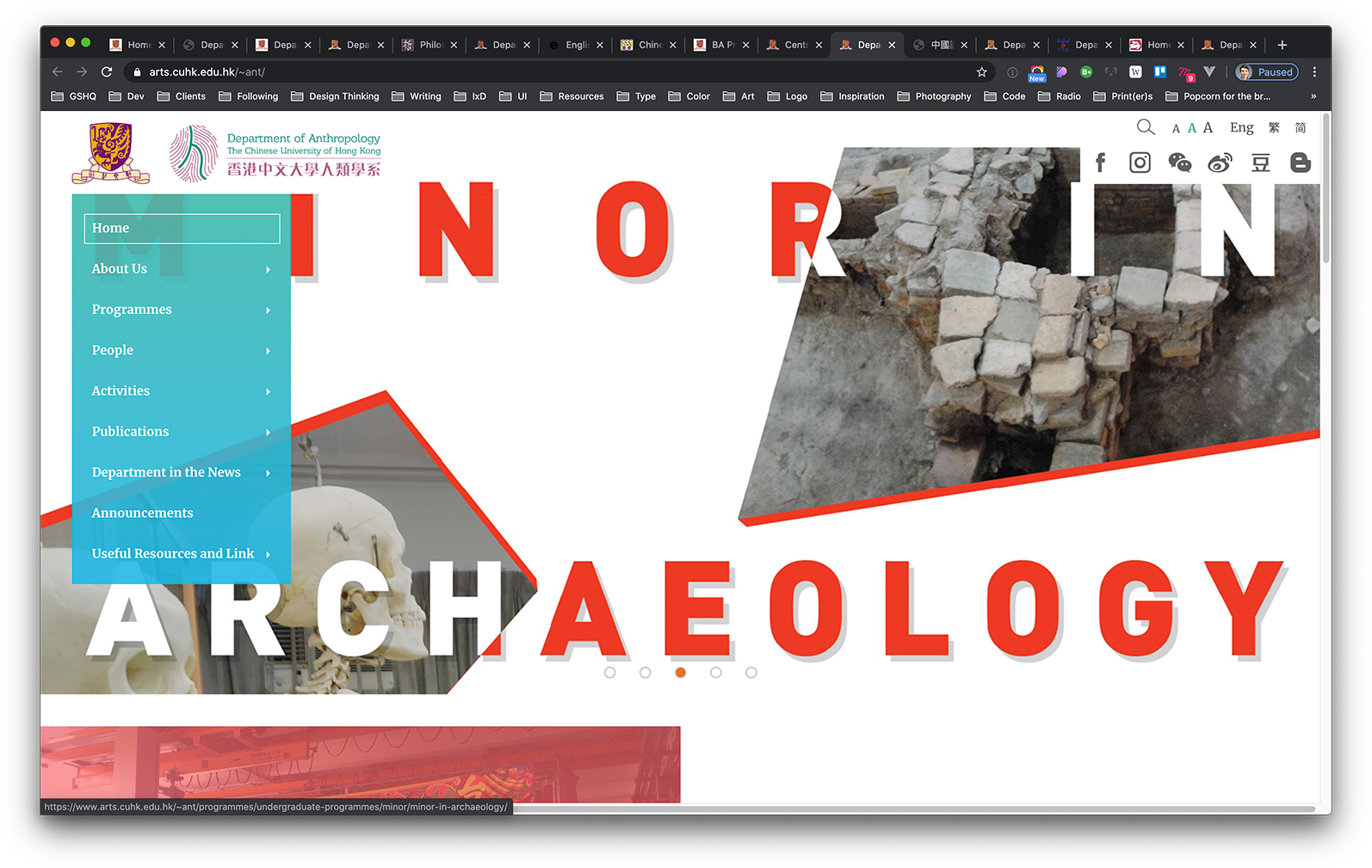
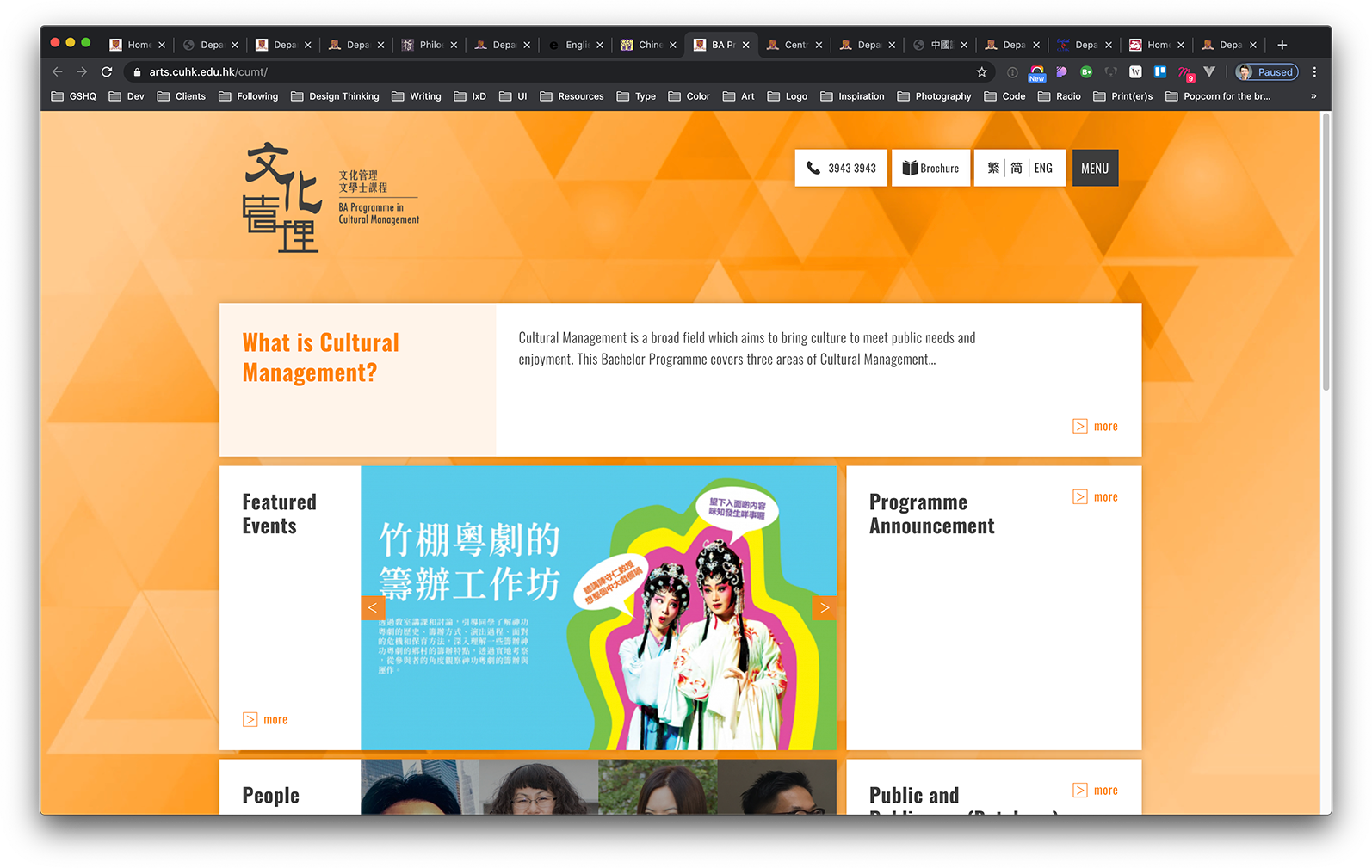
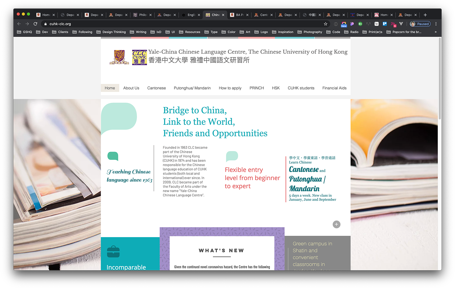
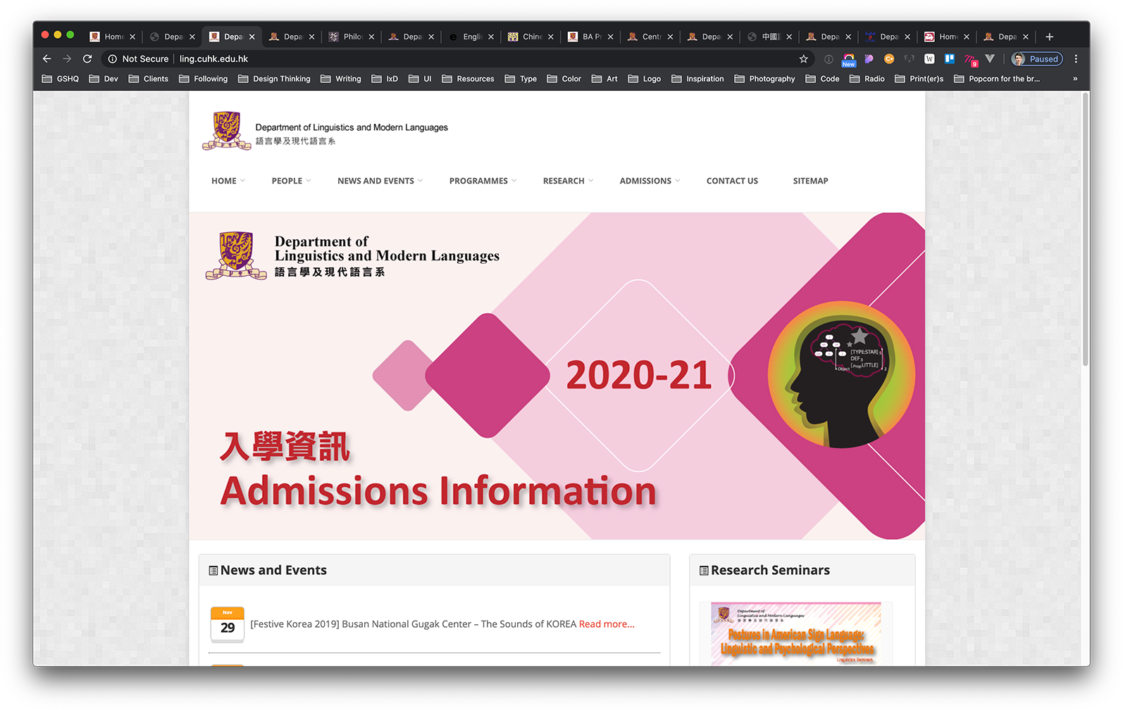
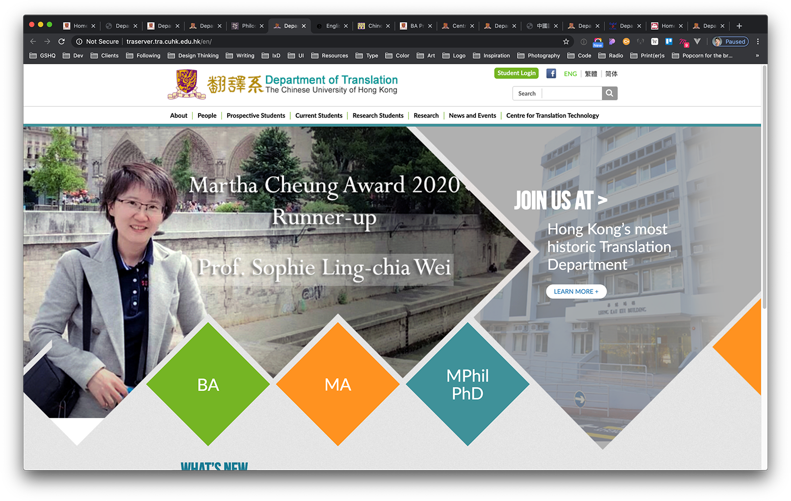
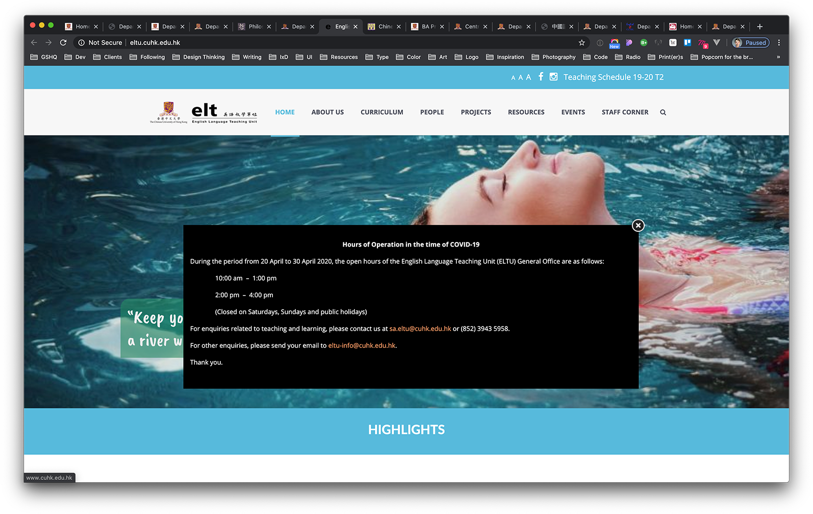
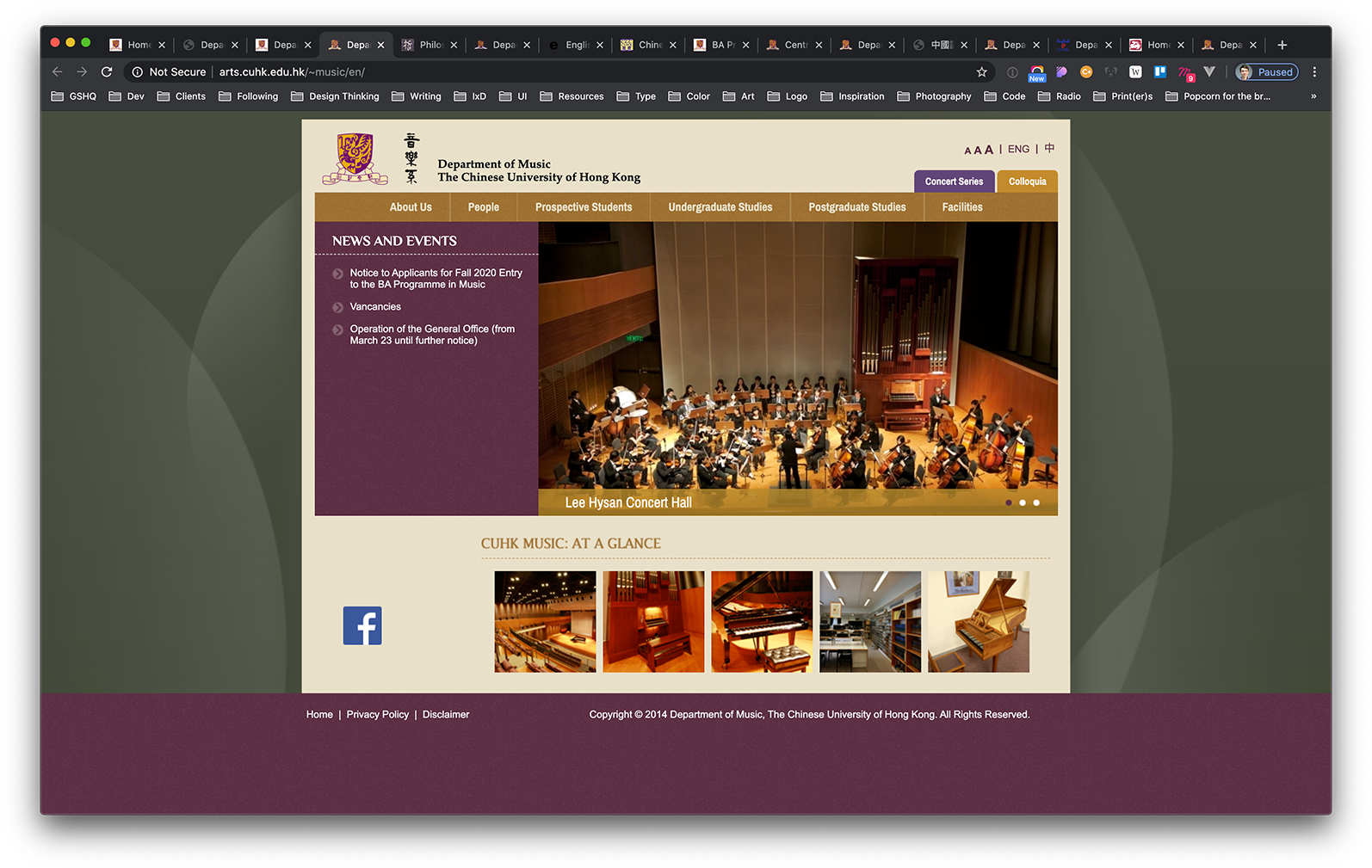
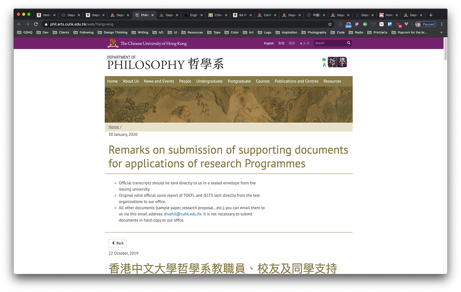
Again, hardly any commonality. Which in itself isn't surprising once you know how difficult it is to make decisions within a department, let alone on faculty or university level. At any rate, this behaviour is the very reason why web designers in Hong Kong will have plenty of work lined up for the coming years, as long as they're willing to navigate the treacherous paths of project managing a project for a university department.
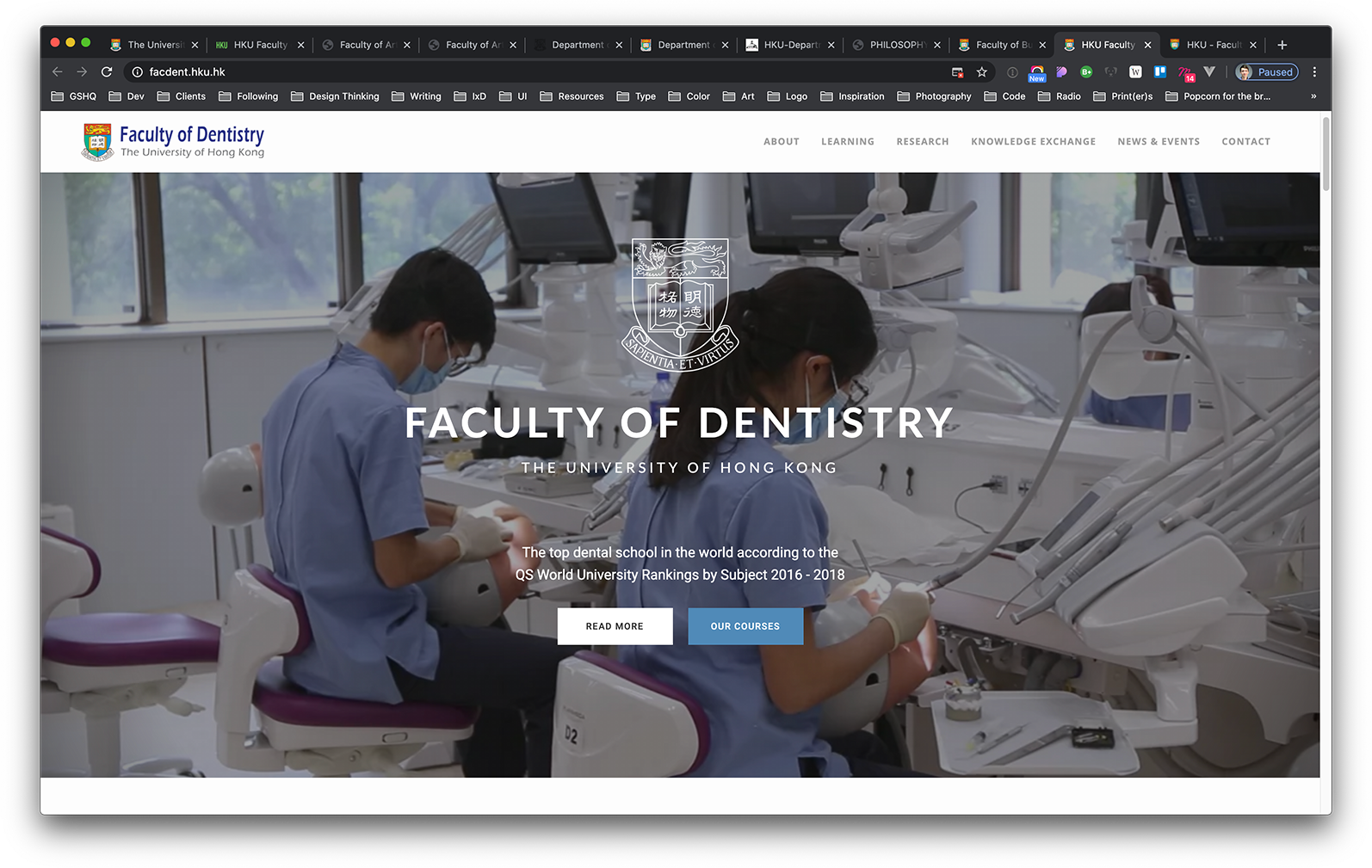
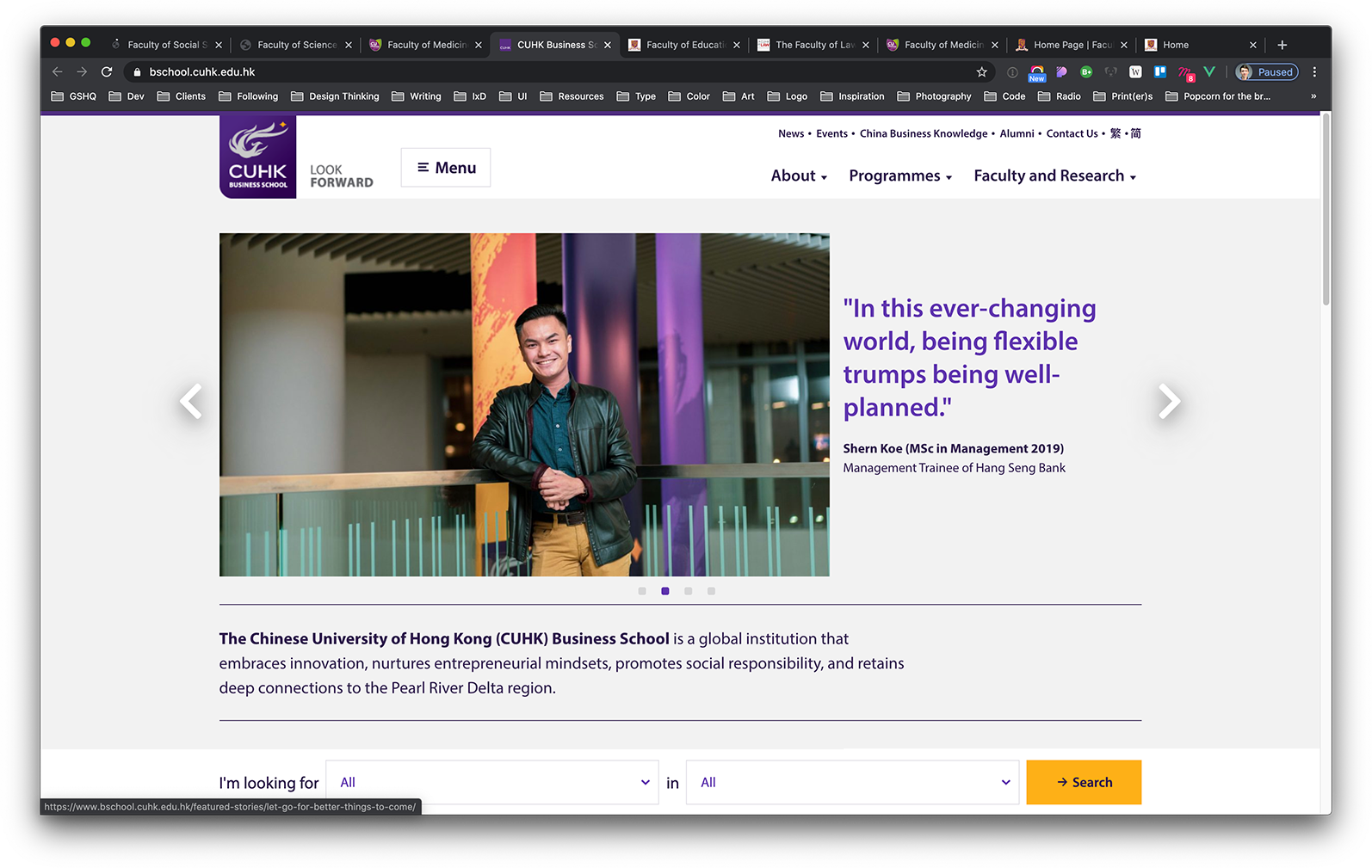
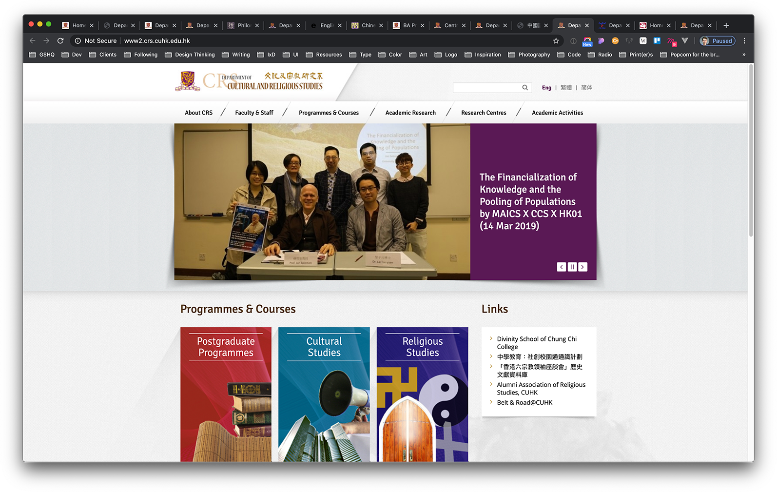
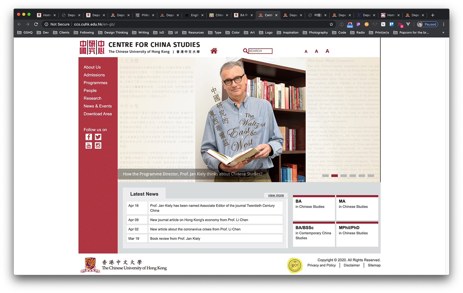
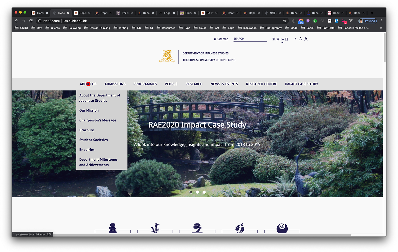
Our challenge rested on the faculty of the Business School at Faculty level: all departmental sites would be spared for the time being.
Bird view
A project of this scale begins with the project owners. In addition to the project owner (the Director of Marketing at CUHK Business School), we had the pleasure of working with department heads from Master's, MBA, and Undergraduate office.
This ensured our project team makes decisions on a bird-view level.
The user should always have a say
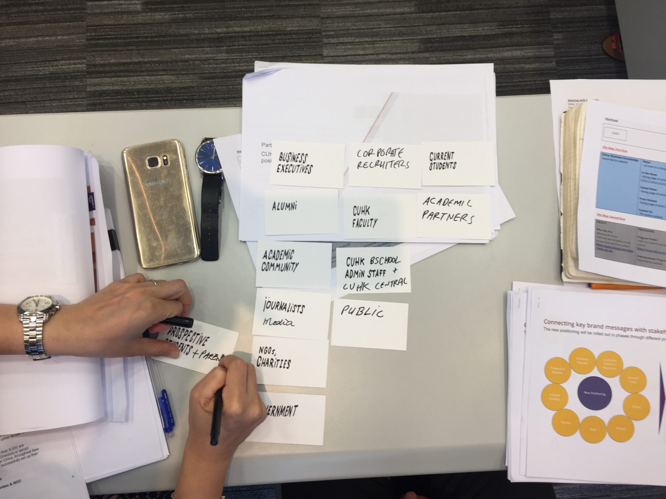
After the initial groundwork was completed in mapping out information needs according to stakeholders, we planned interview sessions with users. Luckily, universities are teeming with users, all in one location. Moreover, they often have time for a quick interview and are quite passionate in sharing their feelings about their current experiences.
We met with current students, most of whom had accessed the old Business School site at some point in time before recruitment. We interviewed them on their preferences, the reasons for choosing CUHK Business School over competition (within or outside Hong Kong) and what kind of role the site played in their decision-making.
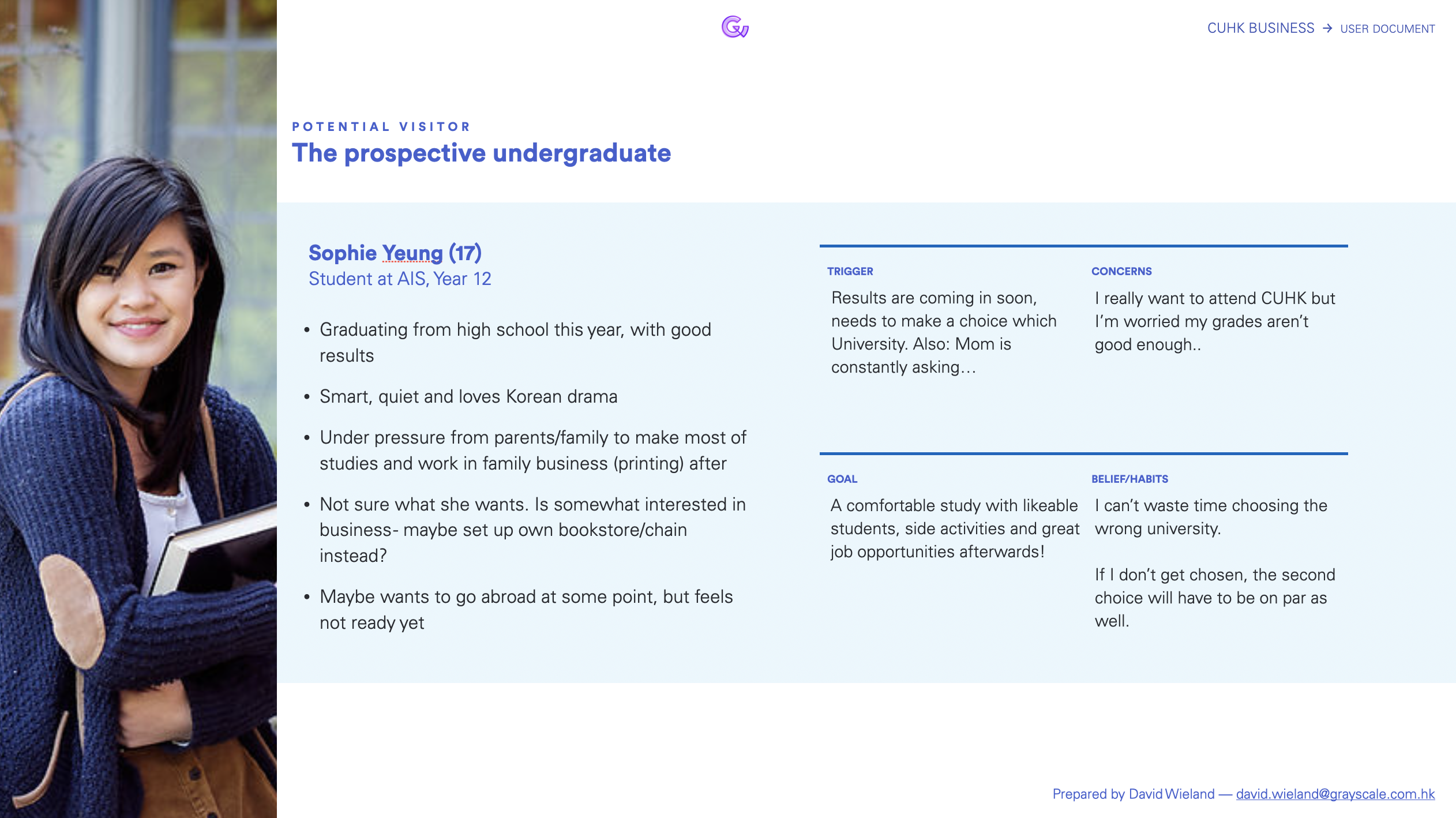
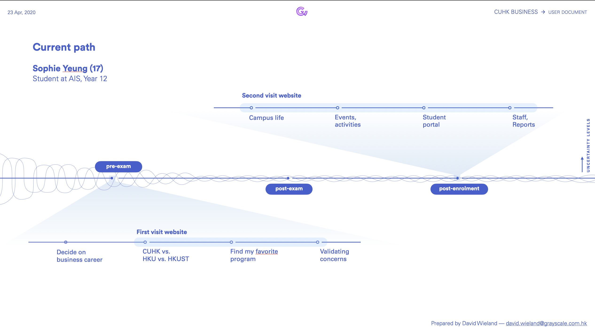
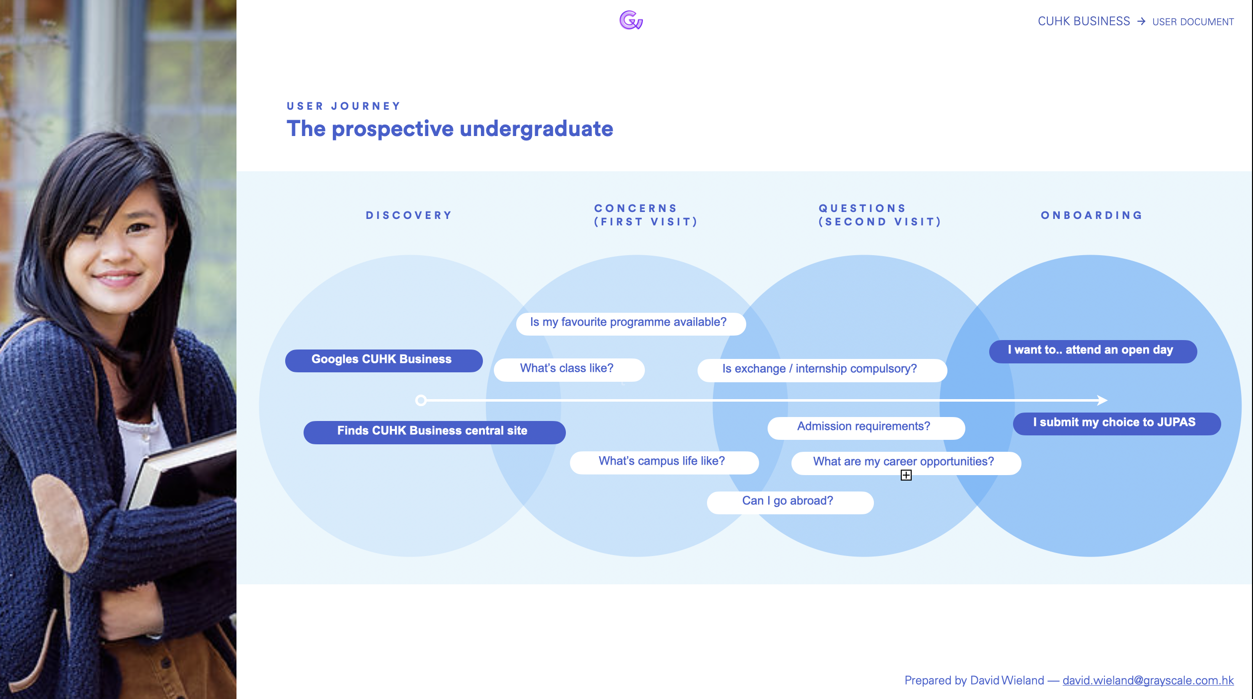
Based on their answers, I prepared these kinds of profiles which later informed our decision-making—
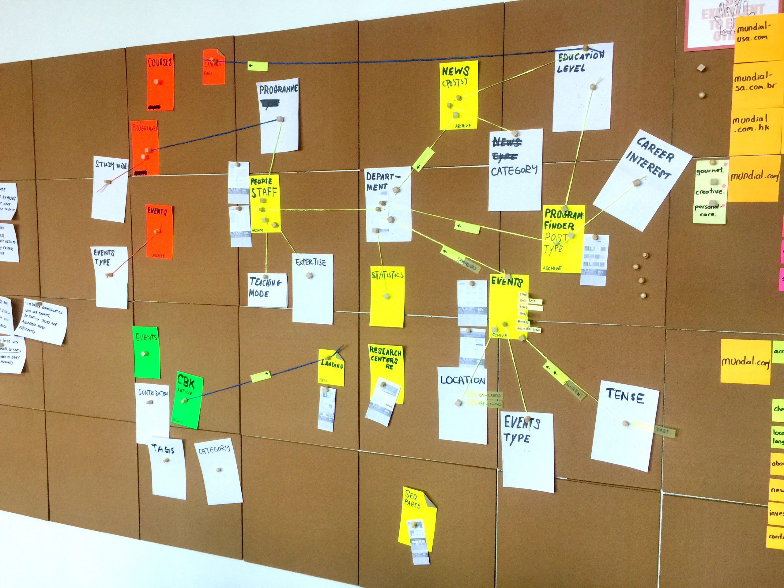
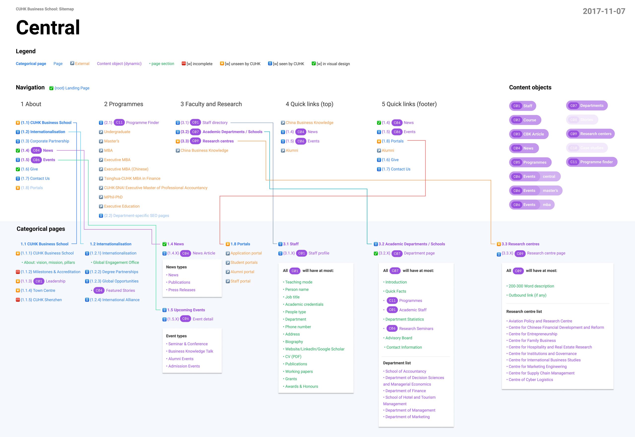
Information structuring
Due to the project scope, this followed waterfall principles which means we're moving the project forward in a linear motion, from abstract to practical proposals—
- Understanding
- User profiles
- Information architecture
- Wireframes
- Visual Design
- Development
- Production
At each phase, we sought hard confirmation from the client, to minimize costs and time loss at a later stage. So we took extra care in each deliverable and made sure the client understood what the ramifications of each decision might be.

Information assessment
The information architecture was a particularly lengthy process because of the sheer amount of content. Before laying down the so-called floorplan for any new site, we first had to unravel all the existing information and assess whether it was critical to any particular user. During any site overhaul, there may be frequent visitors to your current site seeking information. And if we're too careless with our redesign and got rid of some of that information, this visitor will be disappointed. We need to know about these kinds of user cases as well so that we make informed decisions about information retention, instead of cutting it loose and hope it won't matter.
Part of a bigger whole
The parent site was just one part of a bigger whole: at least four other sites were intricately entwined, sending information back and forth. The central site pulls in articles from the Magazine site, and pushes out events to all sites (except MBA, who manages their own events). This flow of content traffic is rife with issues if not carefully mapped out, so that's where most of our attention went in the early design stages.
Tons of undue attention
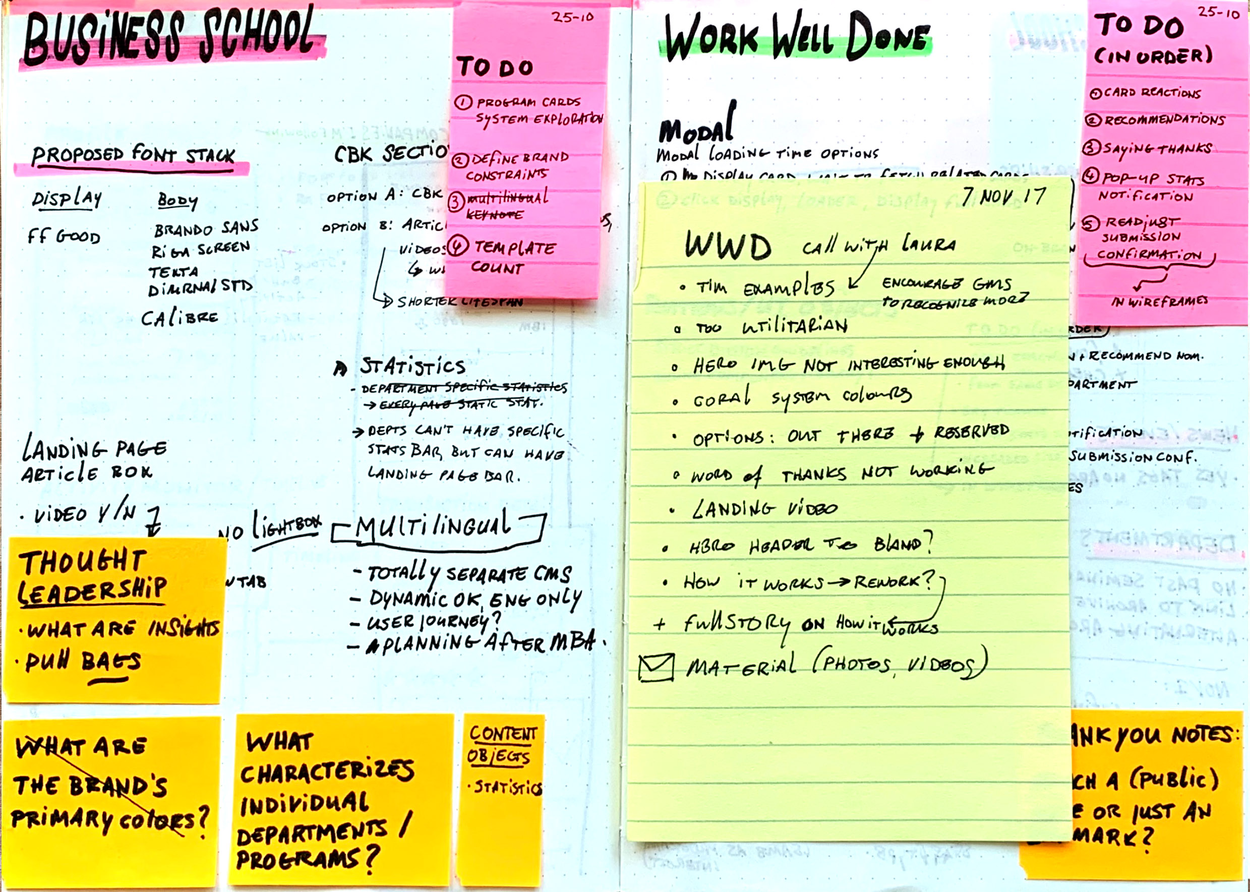
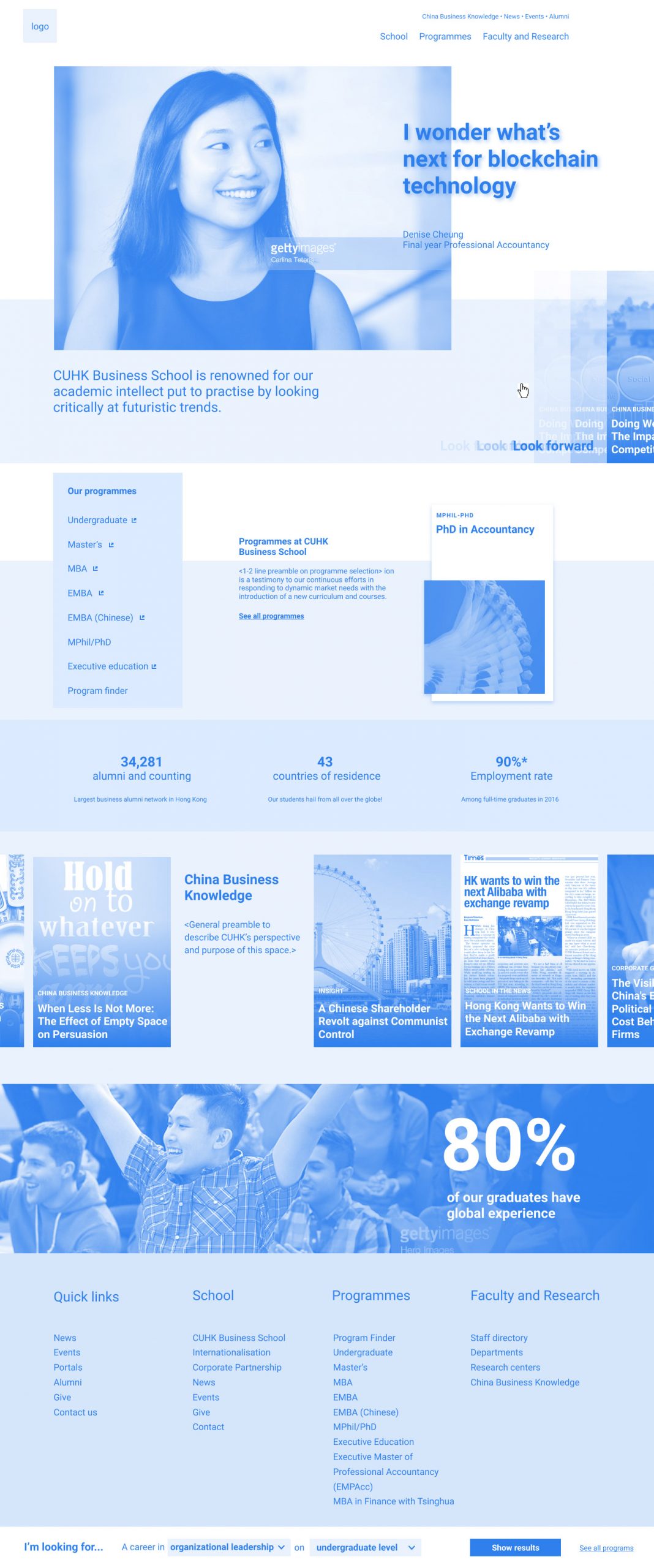
Once that was hashed out in a structure all stakeholders were satisfied with — and I'm glad to report that all stakeholders took this part of the exercise very seriously — we had permission to work on wireframes. The first iterations focused on the landing page, because whether undue or not, it receives a ton of attention during any redesign exercise.
It's for many reasons a tricky exercise, because a good landing page distils the essence of the entire site into a single entry point. It gets trickier if that site is just the portal to many other sub-sites.
The following slider reveals landing page iterations between the first couple of weeks, in increasing fidelity. (In case you're wondering, the reason I like to design wireframes in light blue is because it's slightly less boring than gray.)

Break on through to the other side
The surprising thing about wireframes is you're breaking through to the other side: from the relative safety of abstract infrastructures, you're now forced to compile a reality based on what little information you have on hand. And it's a painful experience to realise a lot of content is either out-dated and poorly composed, and ought to be wrought completely anew.
Wireframes also tend to freak out stakeholders, because for the first time in the project they're suddenly facing decision-making with serious ramifications: ones they (and their peers) can see.
I don't know if there is a universal rule for making wireframes, but I find it absolutely necessary to avoid colour, typographic settings and other asthetic decisions that could distract the stakeholder from focusing on bigger decisions. However, if you keep your wireframes too abstract, stakeholders won't relate the proposed designs to a possible outcome and freak out anyway when it's visual-design time. I therefore find it helpful to feature actual photos in the wireframes. Even if they're not the right photos, those are good discussions to have, because they determine content strategy which shouldn't come a moment too soon.
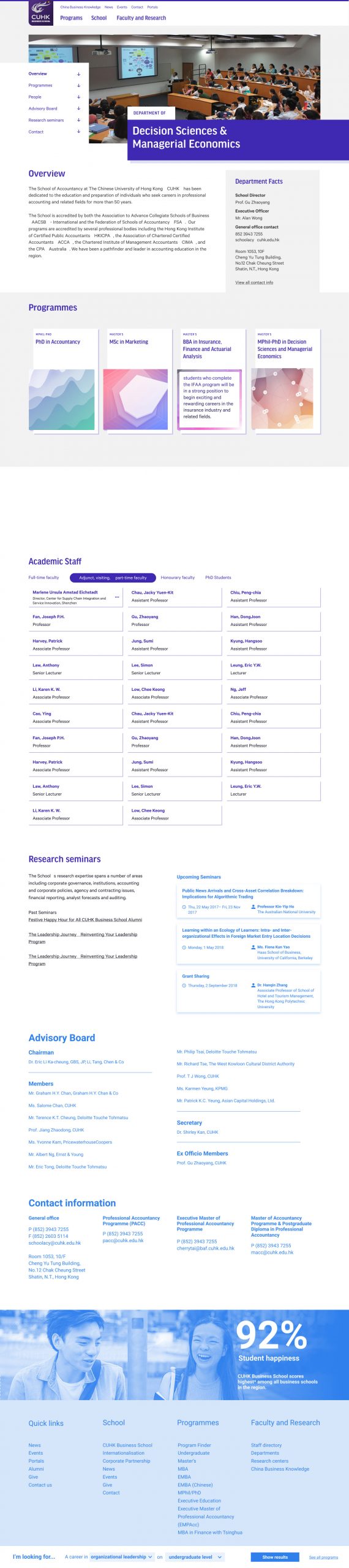
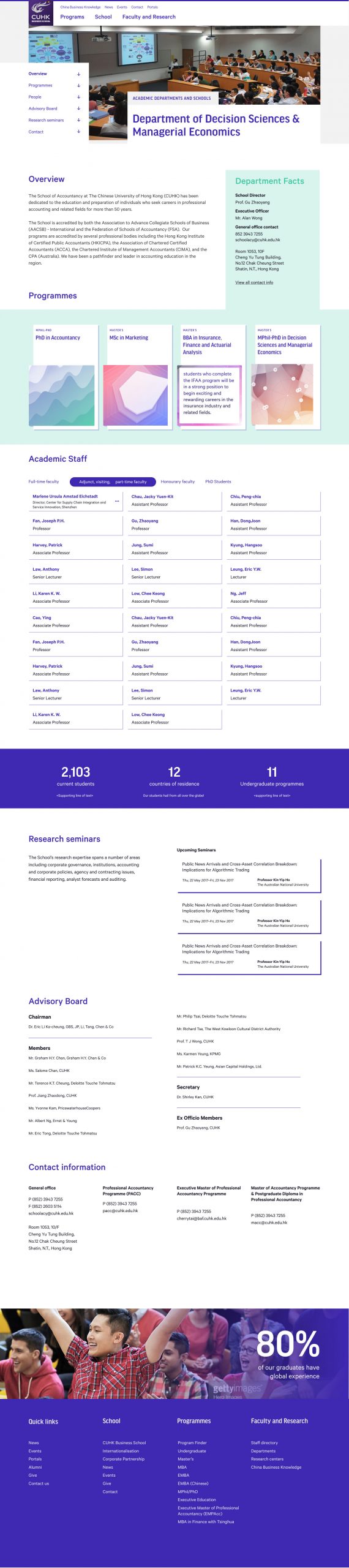
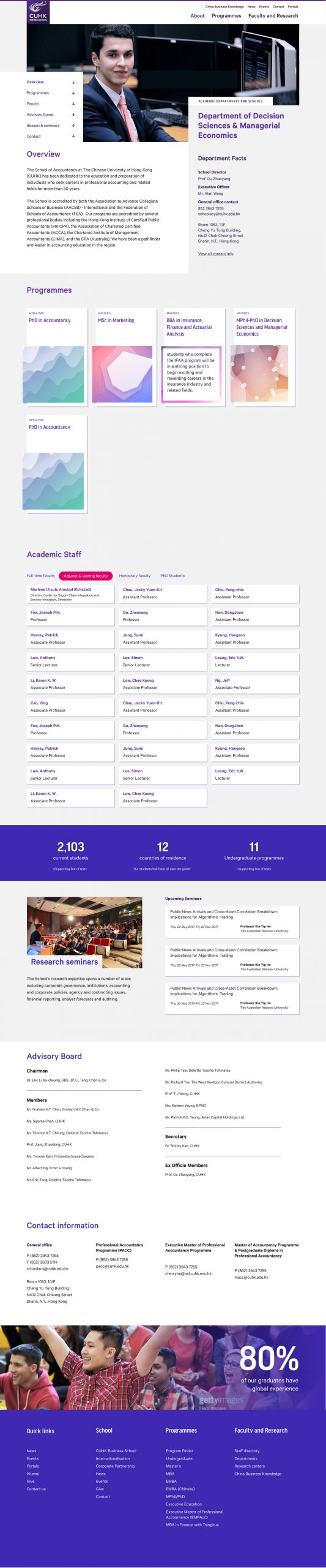
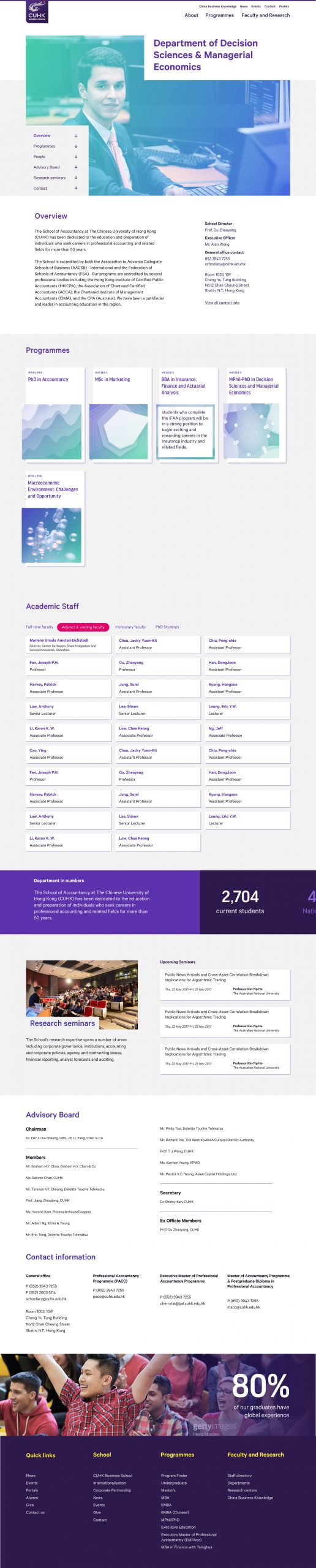
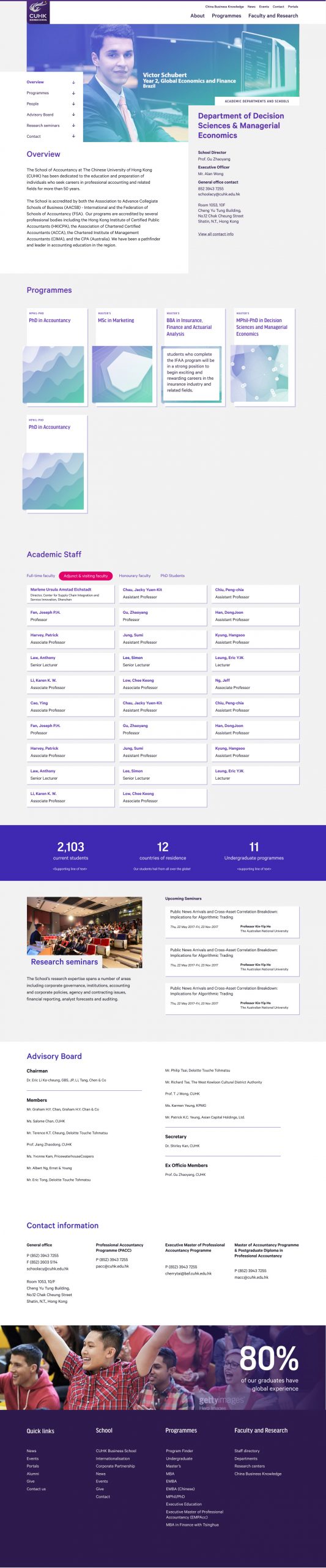
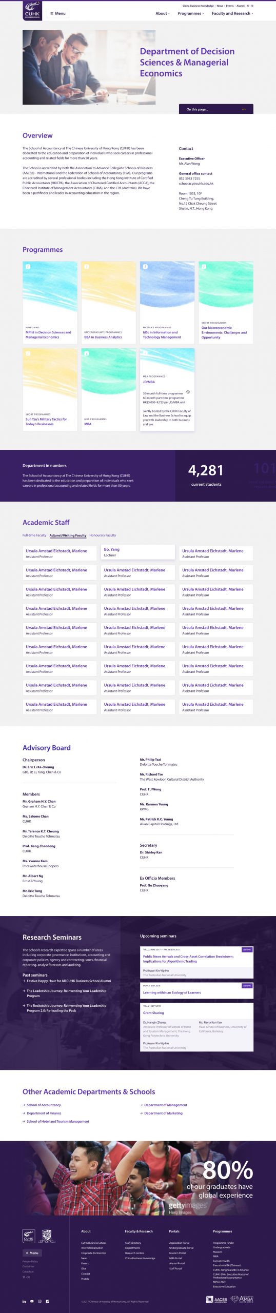
Early Iterations of a department overview page. We decided to lay out this complex page first because it helped us determine colour, type and balance for many objects that would occur elsewhere in the site.
Hey there, this is the default text for a new paragraph. Feel free to edit this paragraph by clicking on the yellow edit icon. After you are done just click on the yellow checkmark button on the top right. Have Fun!