
Design blueprint
Designing how to design
Originally published on Medium by Nikkel Blaase in 2015, I've used this blueprint in every single project and it never failed.
Designing how to design
The design blueprint (as I like to call it) is actually a reality check for any designer embarking on a new project: if you're unable to complete the blueprint, you're actually shorthanded and completely unable to even begin designing a well-informed solution.
How it works
When properly filled out, it tells you in one succinct line exactly what you're designing, for whom you're designing it, why you're designing it and how you'll know if what you've built actually works. This principle is so straight-forward and fundamental that design schools ought to begin by telling you on day one.
No matter how big or small your project is, you're guaranteed to unearth some serious underlying issues that you didn't think your project might have. This blueprint will keep track of all these issues and timely alert you to them. Gather all project stakeholders together, solve this one together and keep it around you at all times!
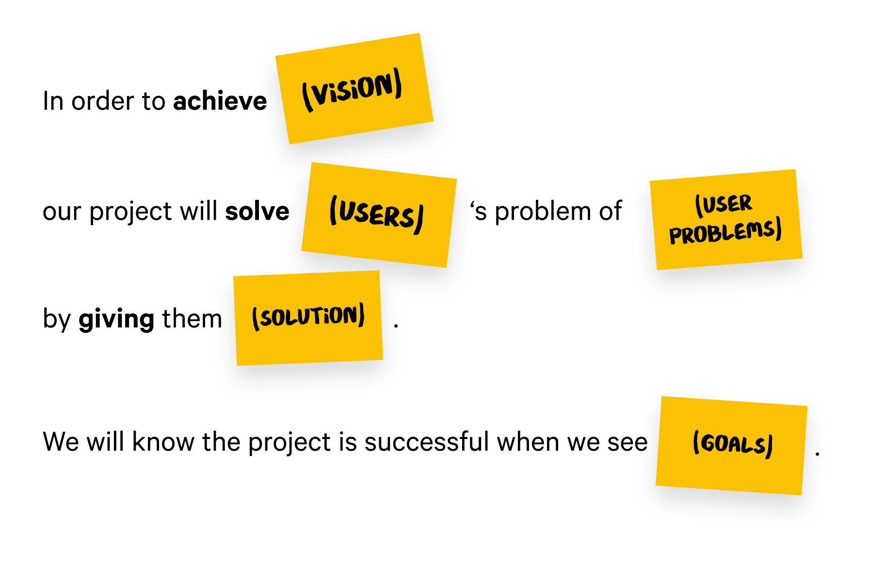
1. In order to achieve (vision)...
A vision is a high level goal that the project owner is hoping to achieve. They're often abstract and on a much higher level than is practical — and that's okay. Ambitious goals help navigate an organisation towards success. For a university it could be, for instance, "to attract and nurture future talent, today." They're succinct and each word ought to be carefully chosen.
Pro tip!
It pays off to be diligent during this stage: the more specific your answers, the easier your next design stages will be. Don't assume anything! Go forth and interview users and stakeholders who interface with your users, then revise this blueprint.
2. Our project will solve (users)'s problem of (user problems)...
Identify who would benefit most from your project, and try to be as specific as you can. Oftentimes, you'll be able to identify at least two (and often quite more) distinct user groups, with a couple of sub-groups in each. For instance, a university web project could have the following user groups and sub-groups—
- Prospective students
- High school graduates (bachelor prospectives)
- Parents
- Young professionals (Master's prospectives)
- Professionals (MBA, executive education prospectives)
- Current students
- Local students
- International students
- Academics
- Researchers
- Job seekers
- Staff
- Academic staff
- Administrative staff
Each group and sub-group are reasonably well represented and have distinct needs and expectations, which means it's important to keep track of them in our design blueprint.
The second part of the equation is the problem each user might have. Again, it'll be helpful to be as specific as possible, and categorise them for each sub-group. What kind of problem would each user typically face, if the project wasn't up to scratch, or even unavailable?
- Prospective students need to—
- compare programmes they're interested in
- apply for a programme
- prepare for the application procedures
- Current students need to—
- find contact information of their teachers
- access their e-learning platform
- Academics need to—
- find publications relevant to their own studies
- apply for a teaching gig
- Current staff need to—
- keep track of all upcoming seminars
- update the site periodically
- keep track of all upcoming seminars
3. ...by giving them (solution).
Here, you succinctly summarise what you're going to give your stakeholders. Being brief is a great way to ensure you're not just going to bullet-list a solution to every single aforementioned problem: that sounds obvious, but isn't a real solution: the actual solution is how you package it all in a neat, consistent project.
For instance, by giving them—
a multifaceted site experience that recruits bright minds to enrol and participate.
Pro tip!
the project vision is typically something the project owner can answer better than anyone else.
4. We know the project is successful when we see (goals).
This is a crucial but often forgotten part of any design project: you won't know if your designs do any good if you didn't set any goals to benchmark against. Goals are best proposed by the project owner (after all, they're the one who asked you to make something in the first place) but typically they need a little coaching to come up with some killer goals. In fancy corp speak they're also referred to as KPIs: key performance indicators.
I like to separate my goals into two chief categories—
- Quantitative goals
- Qualitatitive goals
Quantitative goals can be measured by comparing metrics, for instance page views. But page views themselves aren't very helpful: your project could garner millions of views but if no one's signing up, your conversion is 0. So a better metric would be to measure conversion: how many people enrolled, bought something, signed up, compared to the number of people that visited the site?
Qualitative goals are more icky because you can't measure them with a ruler. Unless you have a galaxy brain and can empathise with your users from behind your standing desk, they can only be obtained during an interview with an actual end user. A good qualitative goal could be, "users are less hesitant during an enrolment process", or "operational staff is happy to help update the site."
Pro tip!
Set your goals together with the project owner, something that preferably ties back to their organisational goals, so that you can prove whether the product actually adds value to their business.
Important!
If your project is slated to replace an existing product or site, make sure you have access to the metrics of the old project before the overhaul. Otherwise you still won't know if your conversion rate went up or down.
Services
User interface design
User research
Information architecture
Prototyping
Content strategy
Project management
Clients
Cathay Pacific
City University Hong Kong
Chinese University of Hong Kong
Good Financial
Hong Kong University
Mercedes
Starr Insurance
Swire Hong Kong
Education
Bachelor of Interactive Media Design at the Royal Academy of Arts, The Hague
Contact
davidwieland@gmail.com
+31641785117
Lovingly made with Semplice in Diemen, The Netherlands
Set in Calibre by Klim Type & Make Sans by Aceler Chua & Grayscale Hong Kong.
© 2020 David Wieland. You have permission to use all resources for personal and commercial purposes.
All other content rights reserved.