
Designing for impossible users
Imagine you're designing a money-lending app for people who are uneducated, financially illiterate, technically incapable, don't use email addresses and can't remember passwords..
That was, in a nutshell, the immeasurable challenge that we faced when Good Financial decided to lend money to domestic workers, the numerous migrant workforce from Philippines and Indonesia, in Hong Kong.
When you're embarking on a project of this magnitude, there are many uncertainties that haven't yet made it to the foreground of the project.
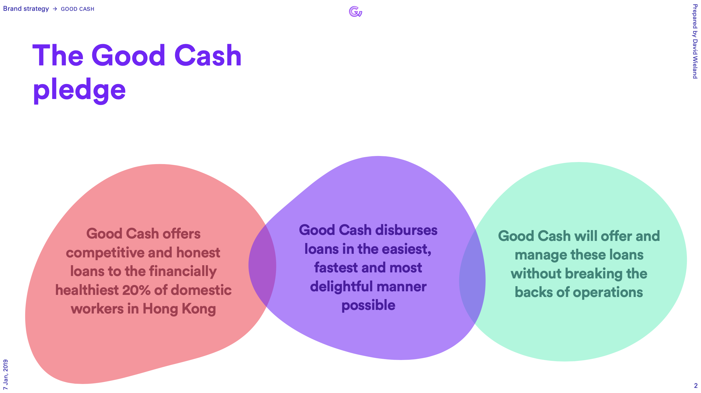
Three requirements quickly materialised:
- Offer competitive and honest loans to the financially healthiest 20% of the domestic workers in Hong Kong
- In the easiest, most painless way possible
- Without breaking the backs of operations, managing these loans
Blank slate
In terms of existing infrastructure, there was nothing to speak of: to test the waters, Good Financial operated almost entirely manually, by inviting domestic workers into the office and do the entire onboarding by hand: contracting, paperwork, documentation, disbursement. The only technical instrument was a CRM that Good Financial used to manage these loans. We had a blank slate.
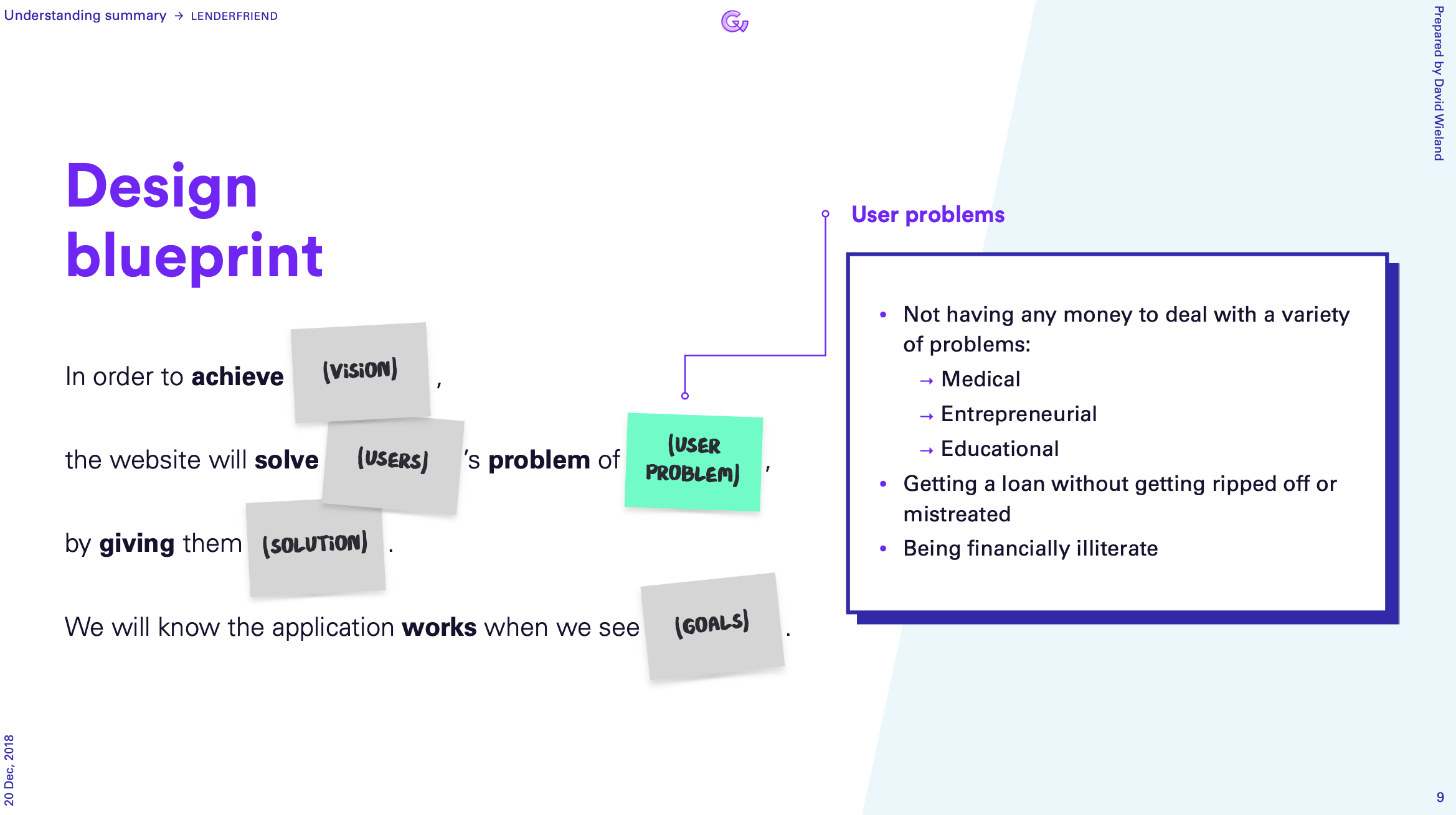
Empathise with the user
There are approximately 400,000 domestic workers in Hong Kong and make up almost 6% of the population. They come to Hong Kong so that they make enough money to send their children back at home to a college, or pay for medical bills. They are required to take loans to pay agents who get them employed in Hong Kong.
Almost every family in Hong Kong has hired at least one domestic worker to help take care of children and elderly, for the minimum wage of HK$ 5500 (~ EUR 500) per month. By law, domestic workers are required to live in with their employer (in often cramped apartments) and work more than 60 hrs per week on average. Despite that both employers and employees master enough basic English to establish rudimentary communication, there are miscommunications abound, causing considerable stress for these people.
Swooping loan sharks
These domestic workers arrive in a foreign land, tumbling head over heels, indebted, struggling to financially make ends meet, navigating culture clashes, all the while making sure they're not getting fired for misunderstanding their employer's instructions.
While all this is happening, loan sharks swoop in to take advantage of these vulnerable people by baiting them with easy cash in hand, only to pin them down with hidden fees, unclear and unfair contract terms, insane interest rates and aggressive collection practises.
Beacon of light
Good Financial vowed to be a voice of reason within this madness; a beacon of light in a sea of shit. Together with their team we agreed on a simple objective for our solution: A smart, simple money lending system that makes money available to eligible domestic workers, lets them manage these loans themselves and provide financial education along the way.
Easier said than done, of course, but this became our benchmark throughout the entire project. It was time to map out how we could make this mission a reality.
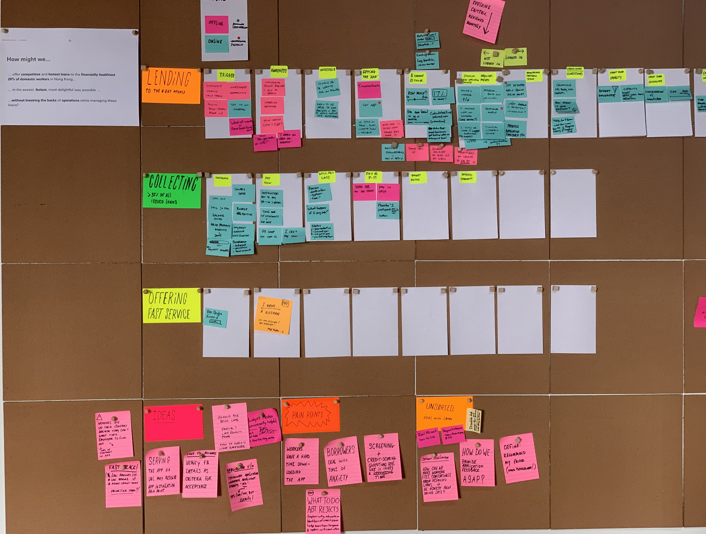
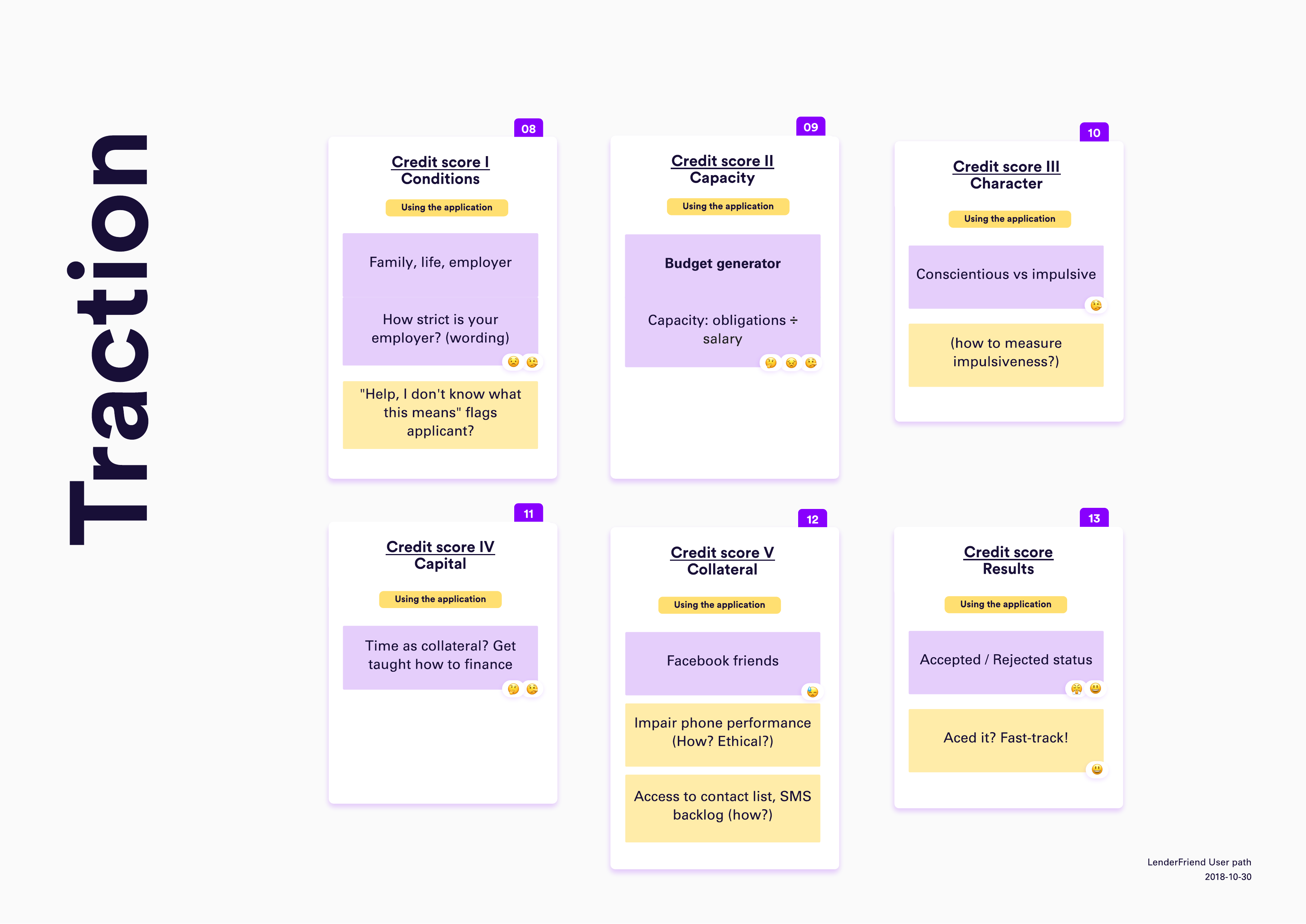
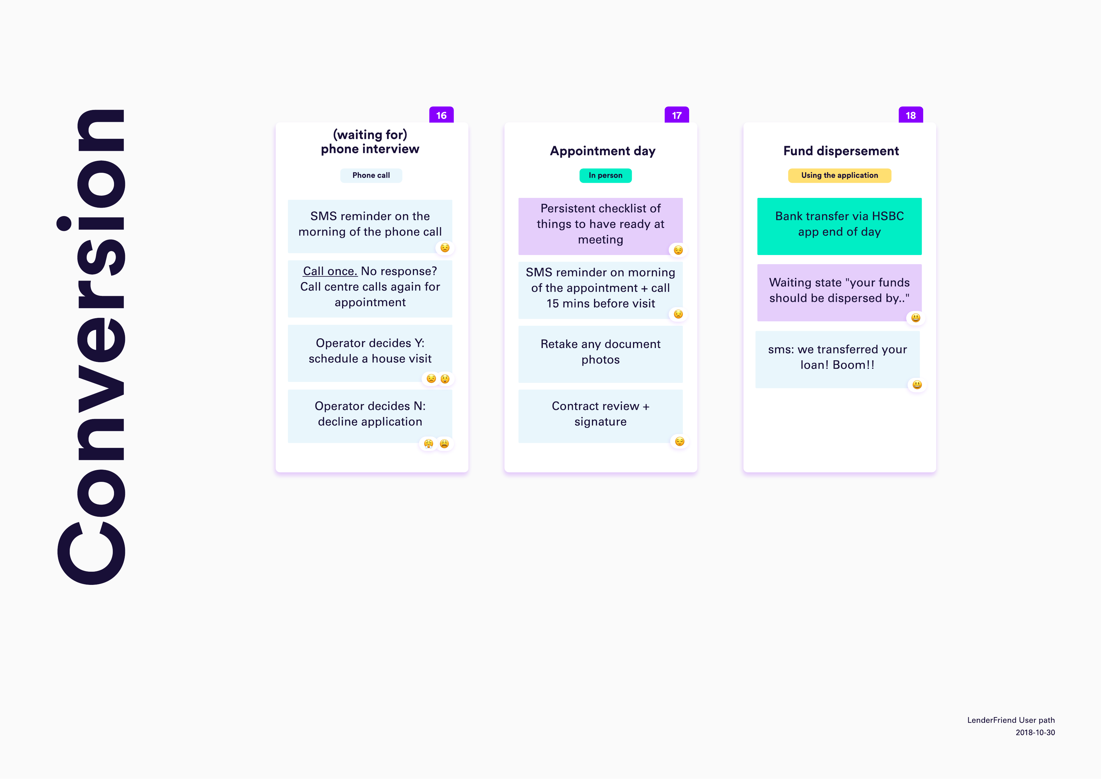
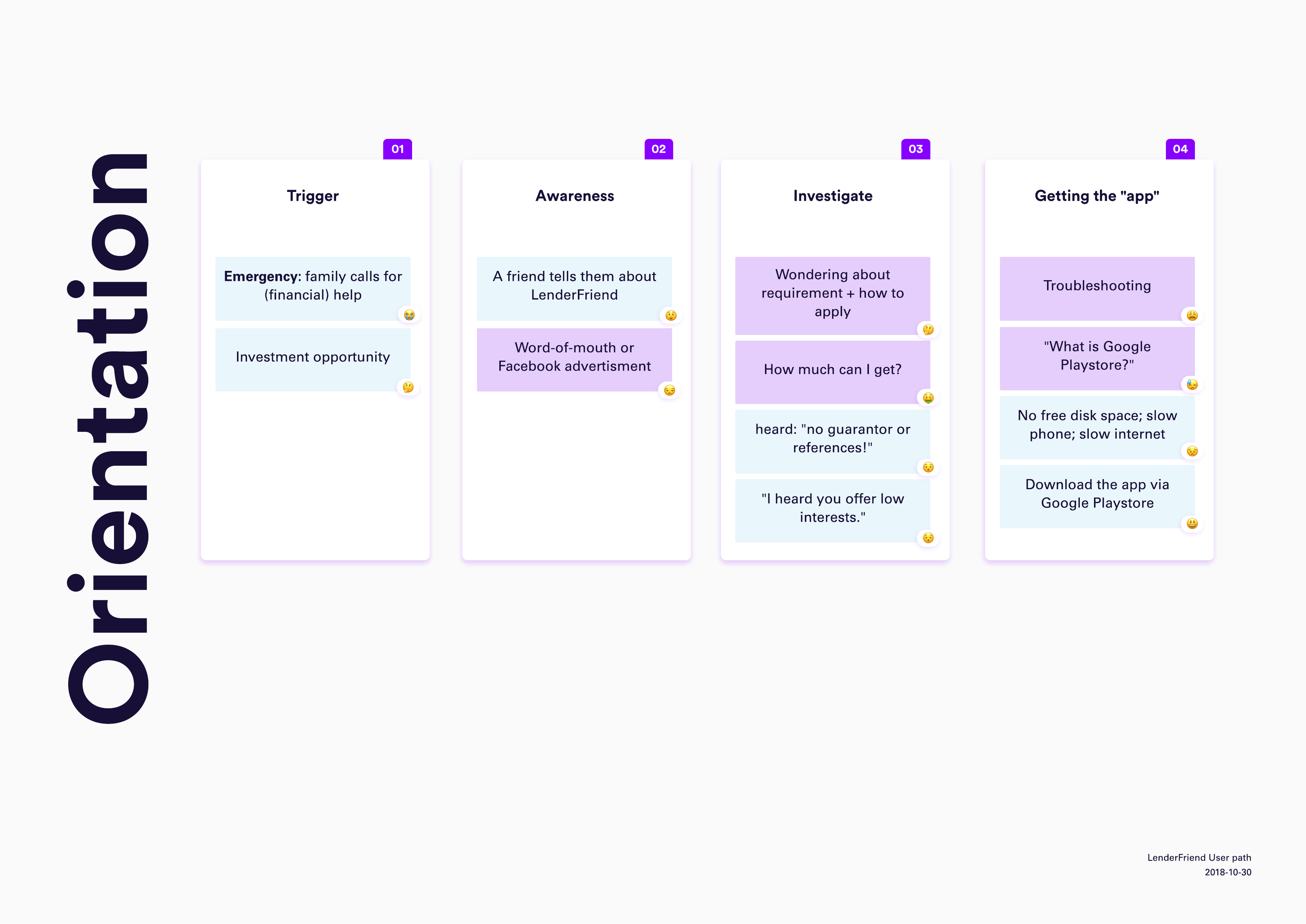
We drafted a function map, leading a potential user from orientation until loan disbursement.
Because this was early in the design phase, we took some necessary liberties, because we can only really judge something when we can look at it as a part of a bigger process.
The stages we identified are orientation, sampling, traction, commitment and conversion. Each stage is sub-divided into steps, some of which are offline, some are online. The steps are supplemented with emoji to depict the user's state of mind during those steps.
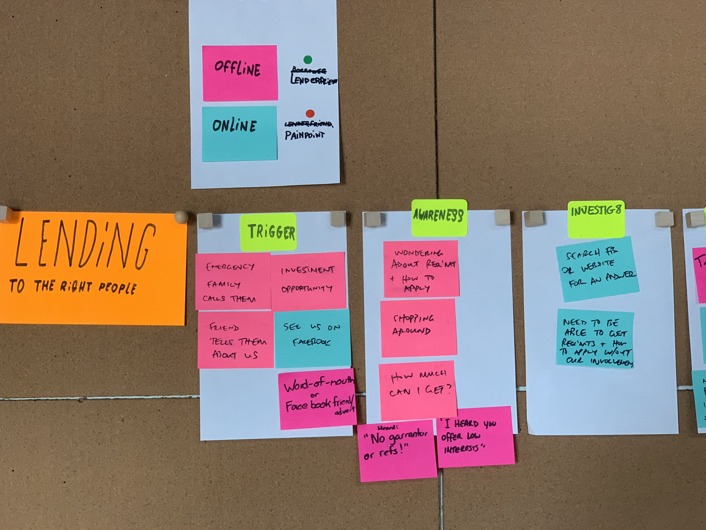
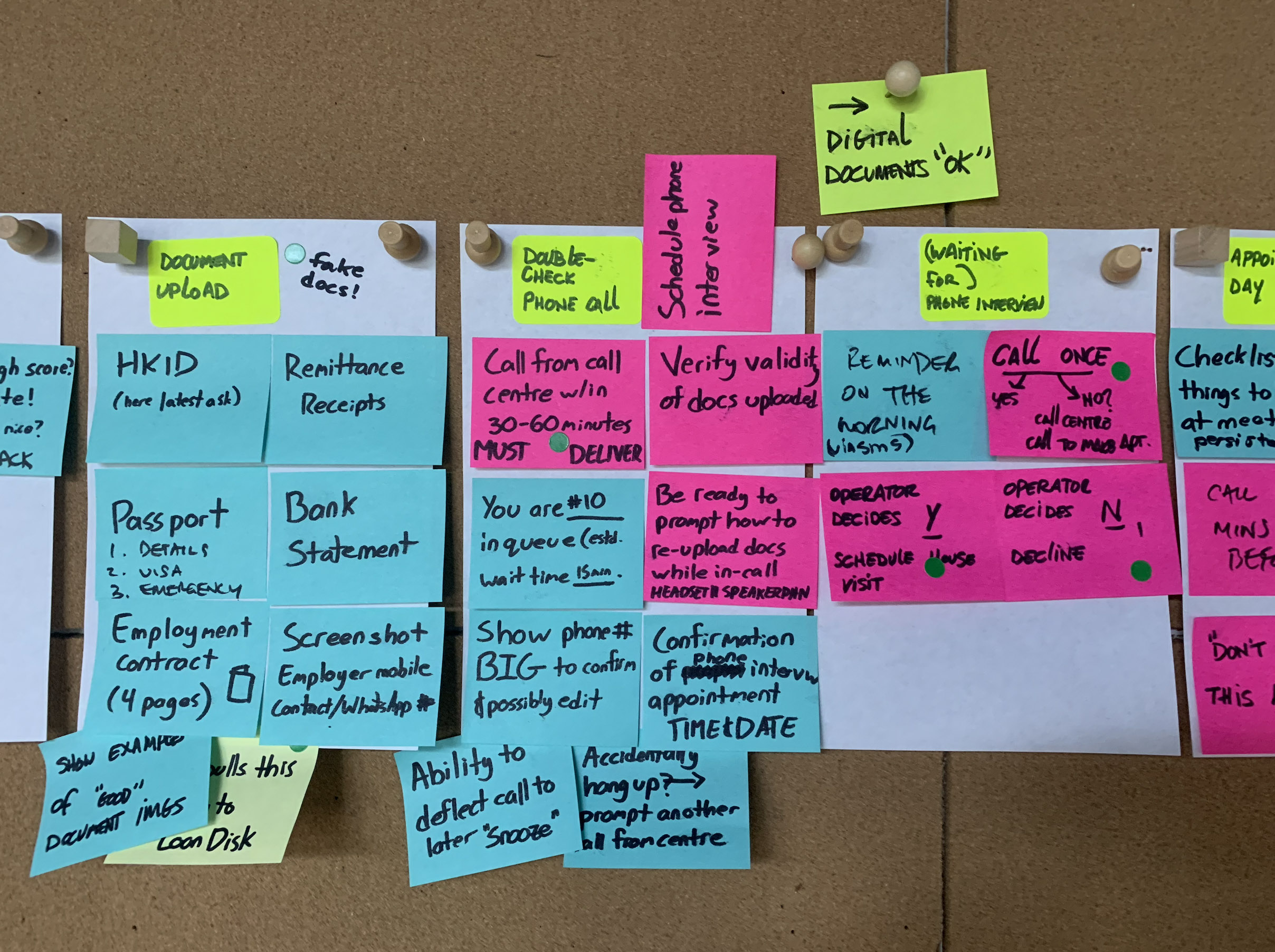
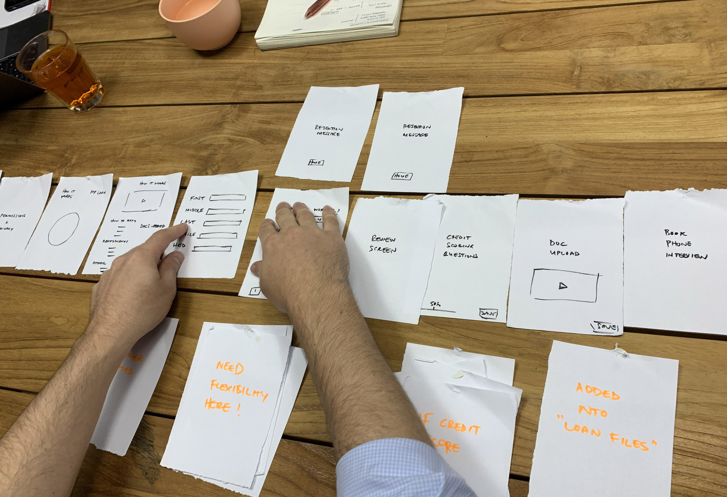
Earliest prototype
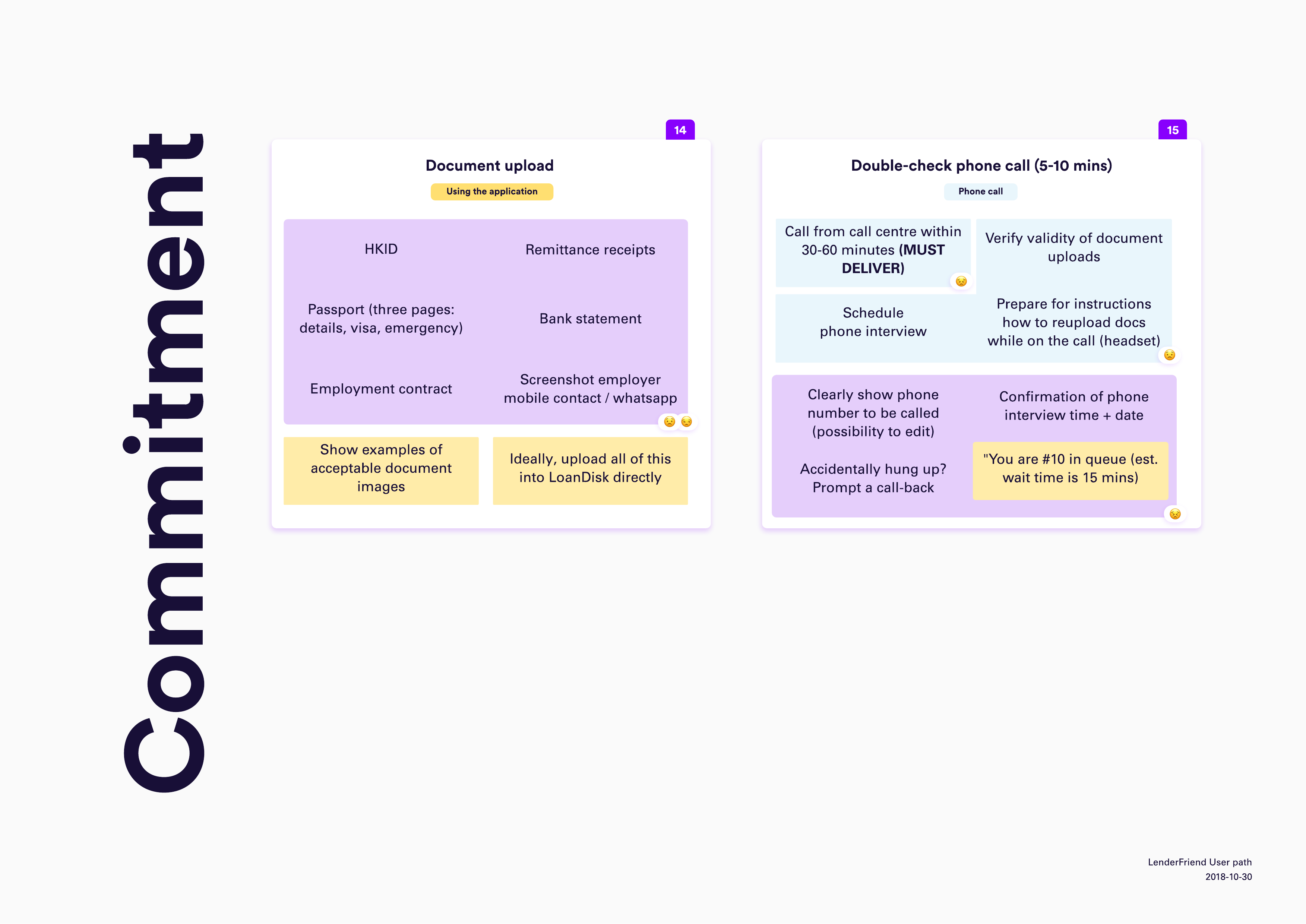
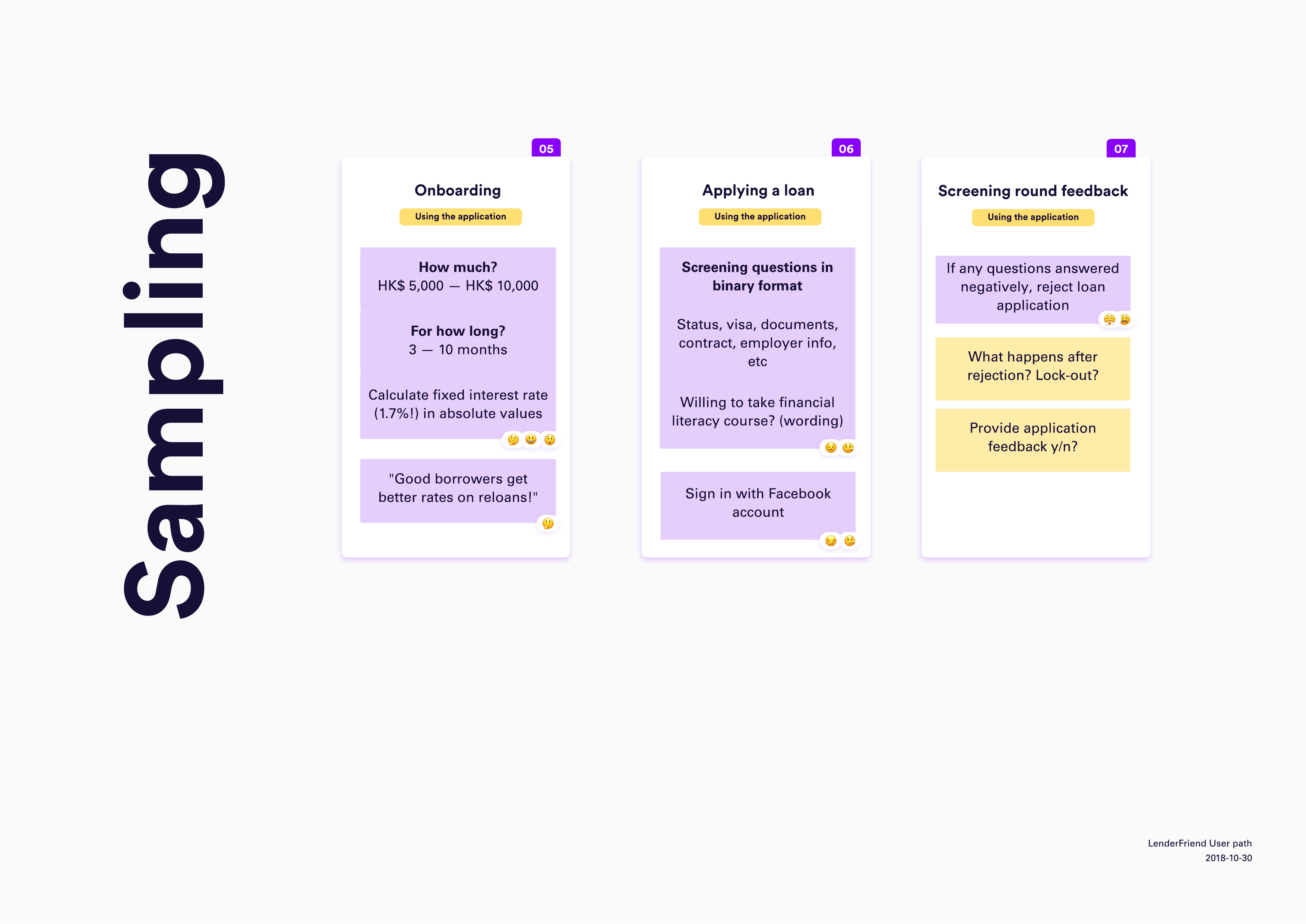
This became our earliest prototype of what is now the successful Good Cash app. This prototype became incredibly useful to spot technical issues, such as what to do when someone does not meet your criteria, the complexity of calculating repayment terms, drafting digital contracts and so on.
It also offered a better view of the expected behaviour than a wireframes might, because designing in user interfaces distracts from real issues such as would a domestic worker download the app in the first place? When would she even have time to submit an application?
When working on a function map, you're forcing yourself to zoom out from the screen's restrictions and consider the surrounding factors of a user, of which often you have no agency over. But you could design with them in mind, making you a considerate designer.
It also exposed that the onboarding process was LONG. There were too many steps that we predicted would trip up a user. We were also concerned that users might find a way to game the system by brute-forcing the correct answers, bypassing the screening steps.
User interface considerations
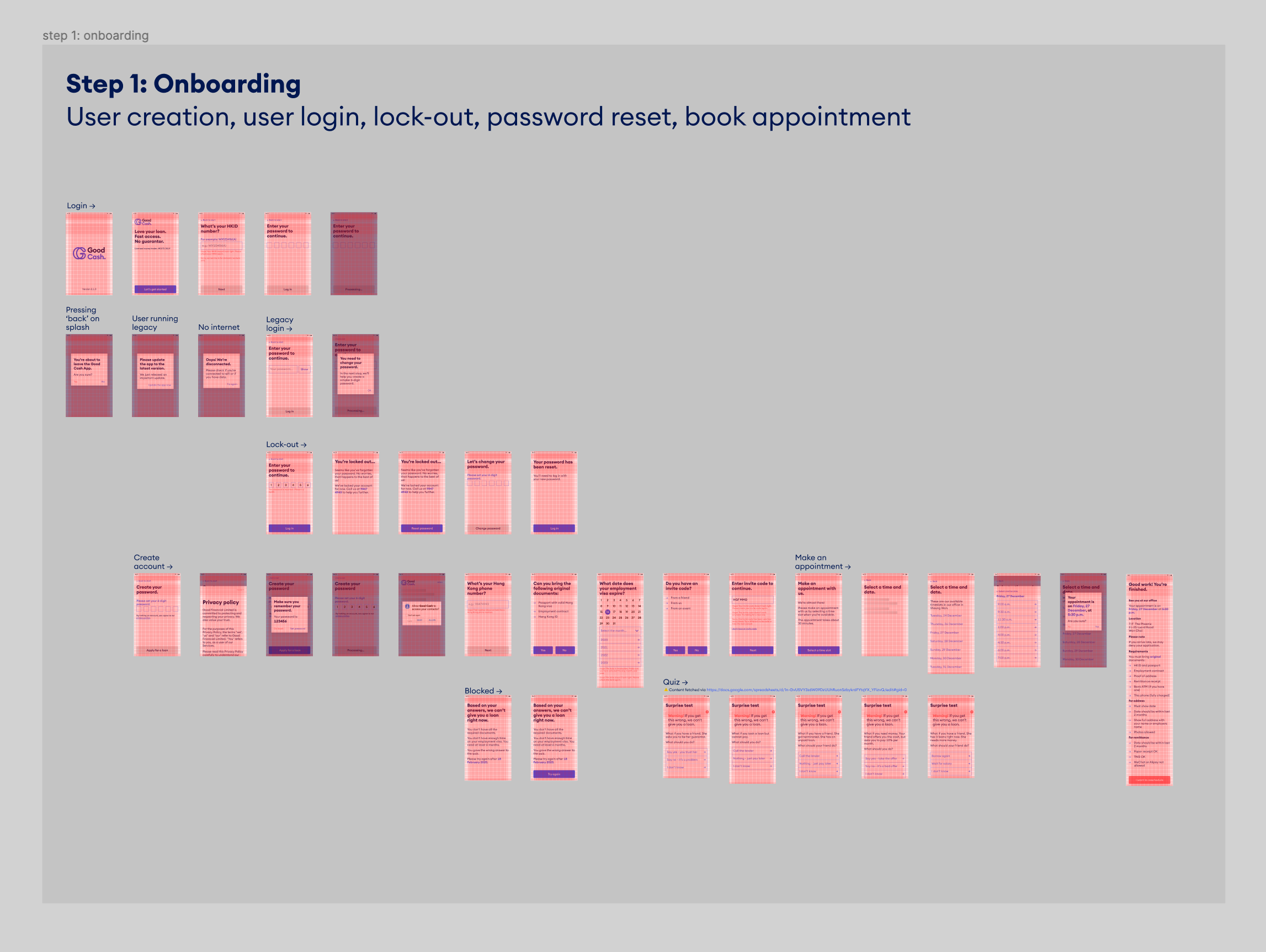
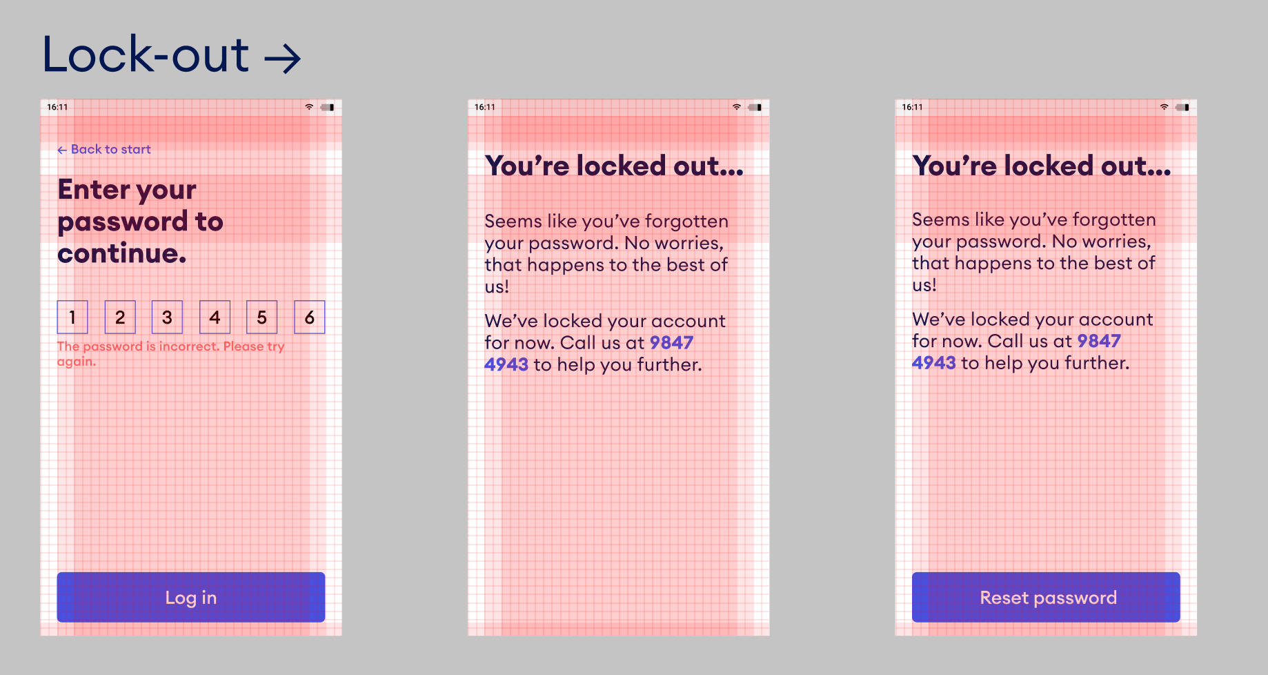
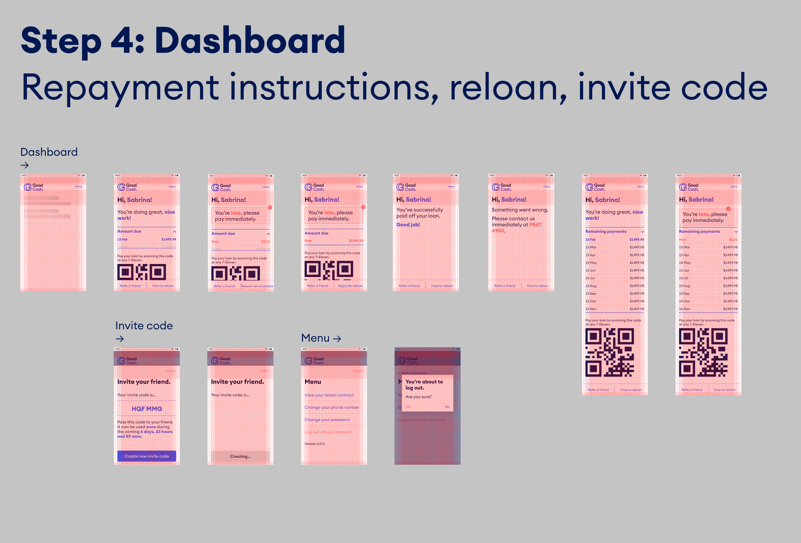
Making a financial client app is like opening Pandora's box: there's no end to server-side technical constraints, client-side limitations, user experience considerations, legal requirements, operational requirements, stakeholder expectations and, in short, "oh shit" moments. Throw into the mix users that don't use email, change phone numbers as often as they change clothes, and can't remember passwords, and you've got yourself a design challenge of epic proportions.
Embarking on the interface layout, we agreed on a couple principals:
- Text-only interfaces in large, friendly letters
This because there's no way we could convey the complexity of the financial obligation of a loan via visuals. We accepted the burden of conveying the importance via text, which forced the team to write simple instructions without hidden meaning. - One function per screen
Gives the user time to pause and focus what's being asked of them. It also helps us save their progress one step at a time, and insert or remove steps when necessary. - One-way traffic
Instead of offering omnidirectional app interfaces with buttons and functions that is bound to confuse the user, we proposed a linear app flow: you can only move forward into the application. Only after the client received the loan, a dashboard with a couple of features becomes available to them.
These principals are again important benchmarks to confirm we're keeping the entire environment consistent.
Branding trajectory
Meanwhile, the Good Financial branding began to take shape by establishing the brand DNA and corporate identity. We're positioning Good Financial as a friendly face in a hostile crowd, which is a gamble: domestic workers are conditioned to expect harsh treatment when lending money and may be suspicious if Good Financial is positioned as a friendly entity.
Above: two logo options and the approved direction.
Production
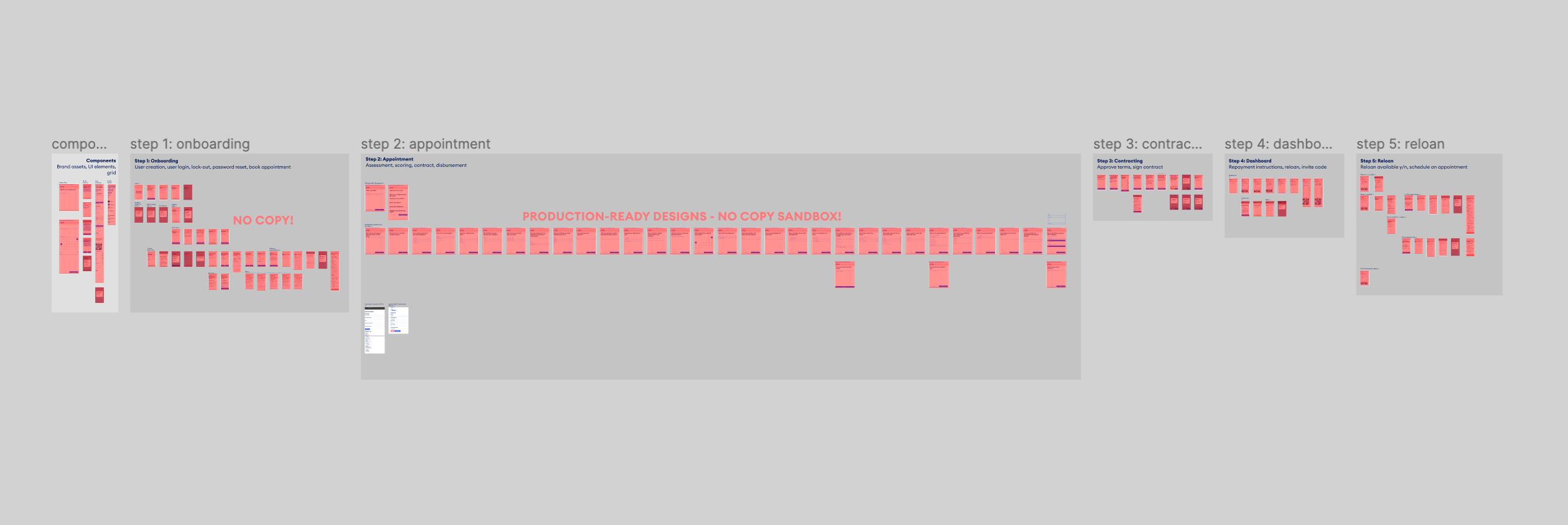
With design principles in place, branding direction approved and a function map that passed the first rounds of user-testing, it was time to prepare screens for production. The entire operation was continuously kept up to date via Figma, with different environments kept separate for production instructions and copywriting adjustments.
This is a project that kept a full team of designers, developers, project managers, and stakeholders busy for over 18 months. Many details have not been addressed, such as untangling the operations schema, the involvement of the various cloud services, the problems we encountered with unreliable APIs, the challenges our team faced when programming the credit-scoring system, and so on. Although I was involved in many of these discussions, I decided here to focus on my contributions to the user-facing, digital aspects of the product.
Services
User interface design
User research
Information architecture
Prototyping
Content strategy
Project management
Clients
Cathay Pacific
City University Hong Kong
Chinese University of Hong Kong
Good Financial
Hong Kong University
Mercedes
Starr Insurance
Swire Hong Kong
Education
Bachelor of Interactive Media Design at the Royal Academy of Arts, The Hague
Contact
davidwieland@gmail.com
+31641785117
Lovingly made with Semplice in Diemen, The Netherlands
Set in Calibre by Klim Type & Make Sans by Aceler Chua & Grayscale Hong Kong.
© 2020 David Wieland. You have permission to use all resources for personal and commercial purposes.
All other content rights reserved.