
Make my logo bigger
When a designer presents their work to you, they are willing and able to defend their design choices. (This does not mean they should get defensive about it. There's an important difference.)
Dear Client,
Your designer has heard your request before: “Please make my logo bigger.” Trust me when I say that this is not a request to be taken lightly. We certainly don’t.
Normal-people-language
Any designer worth their salt presents their design to you under the precursor they’ve done their homework. They believe in the design direction. They’ve rationalised their choices.
This means they can explain to you in normal-people-language why they’ve used blue as a background colour, or why they chose the Proxima Nova font for body text, or why the important buttons are placed in the top-right corner.
When a designer presents their work to you, they are willing and able to defend their design choices. (This does not mean they should get defensive about it. There’s an important difference.)
Back to your request: “Please make my logo bigger.”

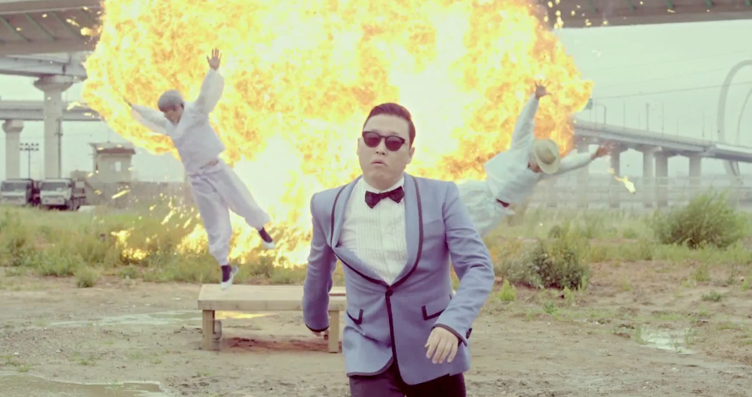
Your designer’s reaction to receiving your emailed request “Please make my logo bigger.”
Nothing is arbitrary
You’ve hired your professional designer to deliver to you a design solution that – according to their research – helps you better sell your products. That means nothing in your site design – indeed, not a single object – is positioned or scaled arbitrarily.
That link to your Facebook page in your footer? Hours of internal deliberation. The absence of a search function? Slamming doors. That plucky serif font in the contact form? Your designers pushing piles of paper off the desk muttering “It’s all wrong!”
So when we receive your feedback that says, “It all looks great, but can we make our logo bigger?” it bites even your seasoned designer. You see, they’ve thought very carefully about that too. The size and position of objects on your site form a harmony so delicate that the moment one object changes, other things begin to feel weird. It’s what designers call ‘balance’.
Upsetting the balance
Making your logo bigger upsets that carefully crafted balance. As a result the navigation bar becomes too narrow. The only way to fix that, is to make it bigger as well. And now the navigation items are drowned out, so let’s make those bigger too. And now they’re bigger than the main call to action on your site. You get the idea.
“Okay… but why is my designer making my logo so small?”
Excellent question! That’s exactly the type of question your designer can and should explain.
The function of a logo is to establish a relationship with a brand. If it’s a familiar brand, it causes recognition. An unfamiliar brand will still need to earn your recognition. So that icon in the top left corner of your site is doing that for you.
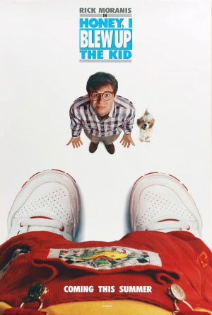
Honey, I blew up the logo.
The order of things
The size and shapes of things on your website are predetermined by your designer. We already learned ‘balance’. Another important word is ‘hierarchy’. Hierarchy is the order in which things should be addressed. What do you want your users to focus on first? Second? What do you want your users to do, and in which order? Again: a designer puts those things in place in deliberate order.
From your designer’s research, it’ll quickly become apparent people are on your site for a real purpose (learning how to ride unicycles). From their first visit to your site, they’ll understand you can help solving their problems (you offer unicycle self-teaching material). They’ll first get drawn in with your key visuals, your promises and your prices. Your logo (a cute unicycle wearing a graduation cap) strengthens your brand proposal, but is hardly their biggest concern.
Increasing your logo may only draw unnecessary attention (“Why is this logo so loud all the time?”). Big logos are often perceived as loud or cheap and often used by price fighters like budget airlines which are heavily in competition with each other.
Asking the right questions
The size of your logo really shouldn’t be your biggest concern. you’re hiring a professional to help you put together a website to stimulate the sale of your Unicycle trainings. If your designer can reasonably explain why things are the way they are in your design, do them a favor: take their word for it. We wouldn’t second-guess our plumber either.
Ask questions like, “Can you explain the size of my logo?”, “What’s the reason for having XYZ appear here?” or “Why is this not a full-screen picture?” gives your designer a chance to back up their decisions. Requesting them to change something puts them in a corner. Designers aren’t assembly-line workers: they’re qualified problem-solvers. Let them solve your problem for you. That’s what you’re paying them for.
Don’t forget: you’re still privileged to make comments! You and your designer are a great team: they’ll learn from you how your business works, and you listen to them when they tell you how to make your business even better.
Services
User interface design
User research
Information architecture
Prototyping
Content strategy
Project management
Clients
Cathay Pacific
City University Hong Kong
Chinese University of Hong Kong
Good Financial
Hong Kong University
Mercedes
Starr Insurance
Swire Hong Kong
Education
Bachelor of Interactive Media Design at the Royal Academy of Arts, The Hague
Contact
davidwieland@gmail.com
+31641785117
Lovingly made with Semplice in Diemen, The Netherlands
Set in Calibre by Klim Type & Make Sans by Aceler Chua & Grayscale Hong Kong.
© 2020 David Wieland. You have permission to use all resources for personal and commercial purposes.
All other content rights reserved.